01 — Context
Quickteller started as a payment app. A decade later, it had outgrown itself.
Quickteller grew from a basic payment utility into something far more complex — but its design and infrastructure didn't grow with it. Features had to exist as separate apps because they couldn't fit the original architecture. Products lived on web but not mobile, or vice versa. The product was fragmented, and so was the experience.
The decision to rebuild from scratch was greenlit after years of accumulated technical and design debt made incremental fixes untenable. Before a single screen was designed, the team had to answer a foundational question: What form should the new Quickteller take?
~10
Years of product growth to untangle
96.7%
Chose the superapp concept
02 — Research
Three phases of research to answer one question
I joined the project during the research phase, contributing to the design sprints that gave the concepts form and the usability testing and reporting that validated the direction. The research ran across three structured phases before a single production screen was designed.
Phase 01
Generative Research
Understood how the current Quickteller impacted users and the business. Synthesised findings into themes that produced three distinct product concepts: Superapp, Hybrid App, and a Family of Apps.
Context I joined into
Phase 02
Design Sprints
Built working models of all three concepts — one per sprint — so usability tests could be run against real interactions, not abstract descriptions. I contributed to building the concept models and structuring the sprint outputs.
I contributed here
Phase 03
Evaluative Research
Usability tests and interviews with 30 participants over 6 days — remote and in-person. I participated in running sessions and co-wrote the research report that delivered the findings to stakeholders.
I contributed here
96.7%
The superapp won by a landslide
30 participants. 6 days of testing. Three concepts on the table. The superapp won decisively — driven by brand trust, ease of use, and device storage considerations. The answer was clear: rebuild Quickteller as a unified superapp. Stage 2 could begin.
03 — My Role in Execution
From Product Designer to Senior — growing with the project
I joined Quickteller as a Product Designer, contributing to the tail end of research and stepping into module ownership as the execution phase began. As the work grew in scope and complexity — and as my ownership expanded from individual flows to cross-cutting quality responsibilities — I was promoted to Senior Product Designer during the project. The progression wasn't incidental; it was earned through the breadth of what this project demanded.
With the superapp direction confirmed, a 6-person design team was structured around ownership. I was the module lead for 11 flows — responsible for research, design, testing, and delivery end-to-end within each. Across the wider product, I also collaborated as a contributor on 10+ additional modules, embedded in cross-functional work with engineering, product, and business stakeholders.
Beyond design output, I ran user testing on both owned and collaborated modules, and conducted repeated design audits of implemented features — documenting findings and recommendations for engineering teams, the business, and senior stakeholders.
Responsibility 01
Module ownership
End-to-end design on 11 flows — from problem framing through research, wireframes, high-fidelity design, and handoff.
Responsibility 02
Cross-module collaboration
Active contributor on 10+ additional modules — embedded alongside other module leads, contributing to design decisions and reviews.
Responsibility 03
Quality & audit
Repeated audits of implemented designs. Documented findings for engineering, business teams, and leadership to close the gap between design intent and shipped product.
Modules I Owned
04 — Account Verification / KYC
Making compliance feel like progression, not punishment
KYC gates access to higher-value capabilities — but most platforms implement this as a surprise wall: users discover the restriction mid-flow, often after they've already committed to an action. That friction destroys trust and causes abandonment at exactly the wrong moment.
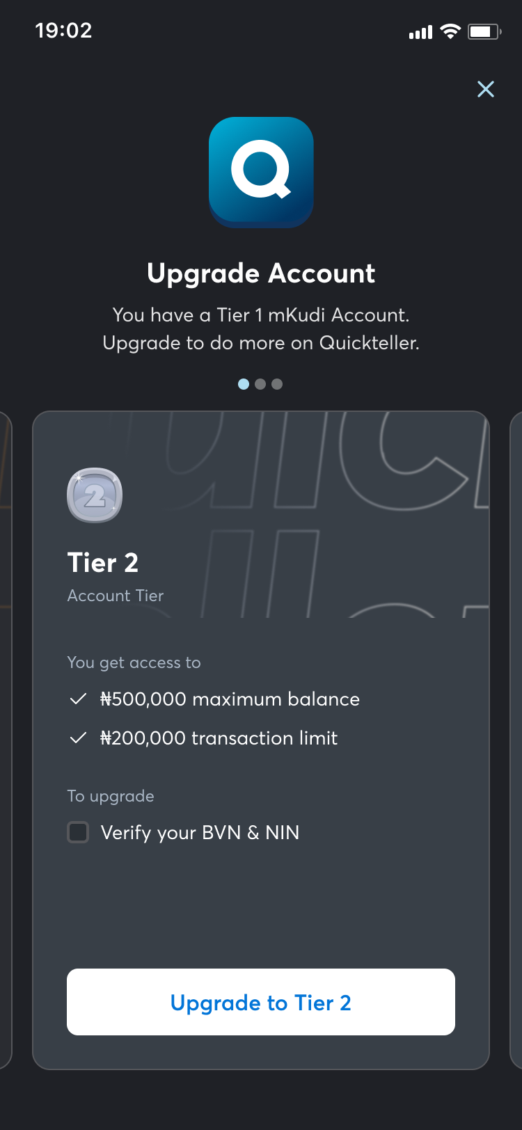
The design approach inverted this. Pre-communicated tier requirements meant users always knew what they'd need to unlock before they started. A progressive checklist showed the full verification journey upfront — not as a compliance form, but as a capability unlock. Each completed step revealed what it enabled, making the process feel like advancement rather than interrogation.
Clear "why this matters" framing at each step reduced drop-offs caused by distrust. Users who understand why a document is needed are far more likely to provide it than users who feel surveilled. And meaningful feedback at every step — not just success/error states, but contextual guidance — meant no one was left confused about what to do next or why something failed.
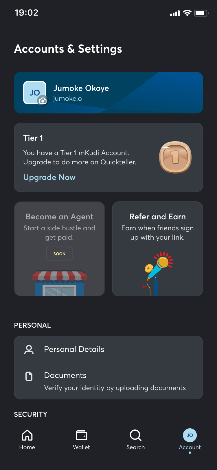
Tier 1 status — upgrade prompt
Tier 2 — capabilities + requirements
05 — Recurring Payments
Set it once. Trust it completely.
Recurring payments carry a unique anxiety: users are giving the platform permission to take money from them automatically — often long after the initial setup. The design challenge was building a setup flow that felt authoritative enough to deserve that trust, and a management interface that made it easy to stay in control after the fact.
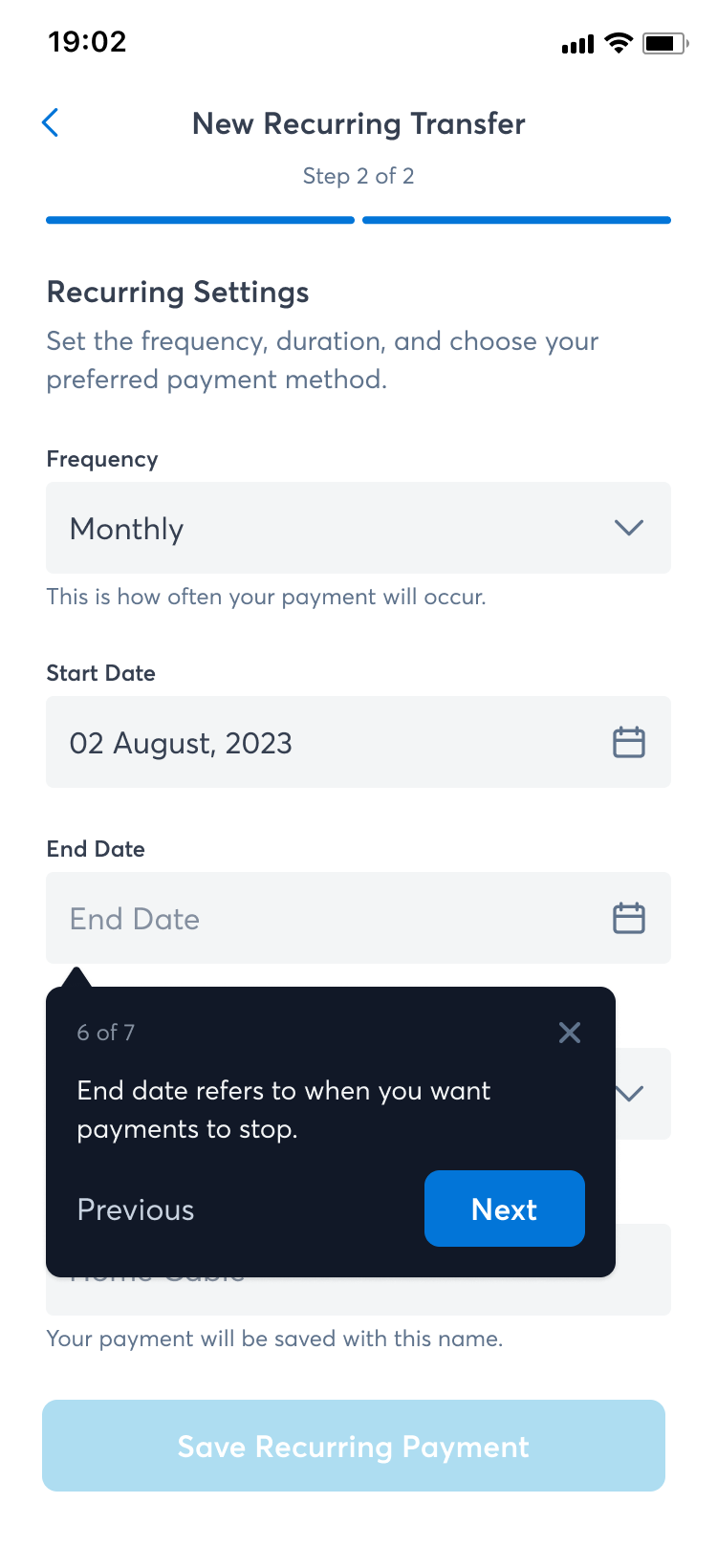
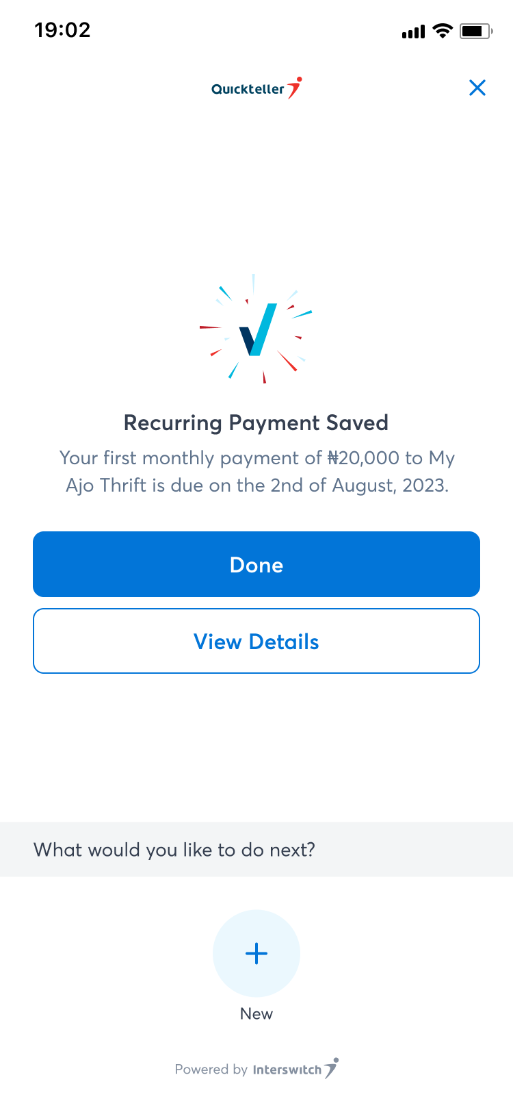
The setup flow surfaces all the key parameters — amount, frequency, start date, end condition — in a clear sequence with full review before confirmation. No ambiguous "and it will keep going" language — every recurring instruction is explicit about when it starts, what it costs, and how to stop it. The management view shows all active and paused schedules with one-tap pause, edit, and cancel actions. Users should never have to hunt for the off switch.
Step 2 — frequency, dates, payment name
Confirmation — next payment date shown
Ends
After 12 times
On a date
Never
Review schedule →
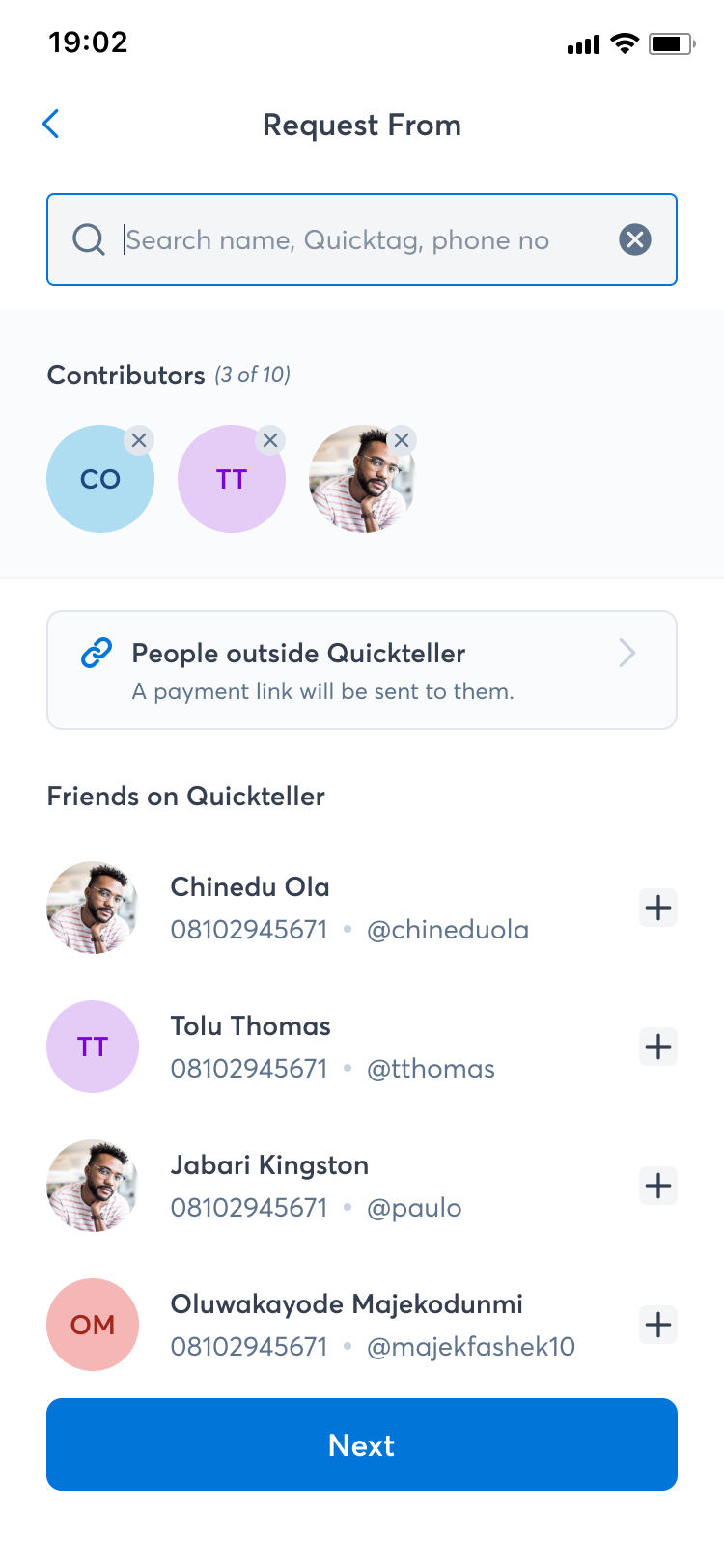
06 — Split Payment
Splitting a bill shouldn't require a spreadsheet
Split payments involve multiple parties, multiple amounts, and often — some social awkwardness. The design had to handle the arithmetic invisibly while surfacing the right information to the person initiating the split and the people receiving the request.
The flow supports equal splits (divide automatically) and custom splits (assign specific amounts per person). Real-time running totals prevent over-allocation without requiring mental arithmetic. Participant selection draws from the user's existing contacts and beneficiaries — minimising re-entry friction. Each participant receives a clear, actionable notification with the amount owed and a direct payment path. The initiator gets a live status view of who's paid and who hasn't.
Participant selection from contacts
3 contributors added — active selection state
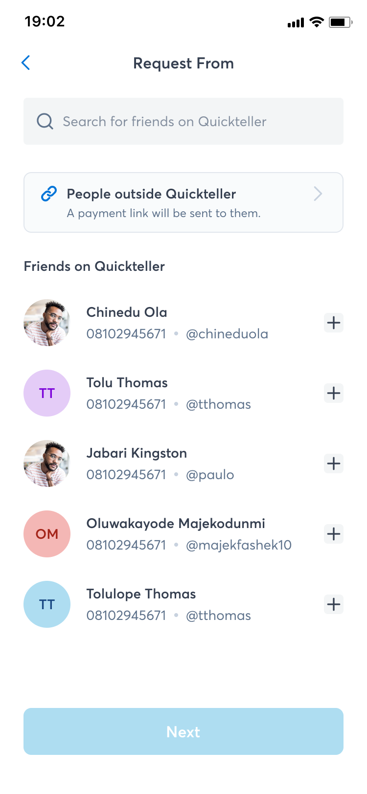
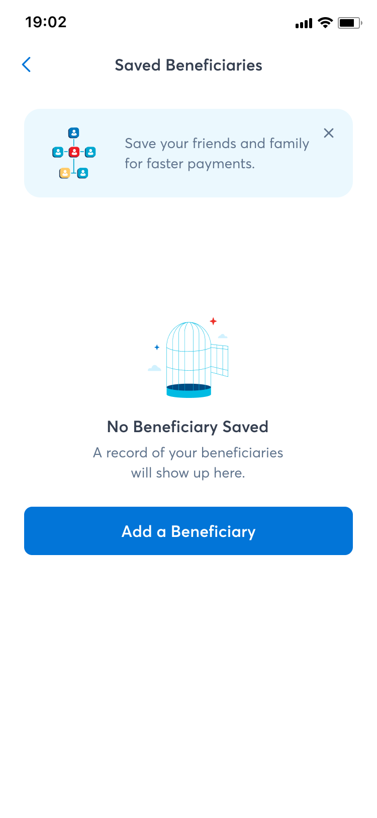
07 — Beneficiary Management
The contacts list that earns its place in every flow
Beneficiary management is infrastructure — it sits beneath every transfer, split, and recurring payment flow. If it's slow, confusing, or untrustworthy, every dependent flow suffers. The design prioritised speed and confidence above all else.
Quick-add from transaction history means users never have to manually re-enter someone they've paid before. Inline verification at the point of adding a beneficiary confirms bank details before they're saved — preventing failed transactions downstream. Beneficiaries are organised by frequency of use, with search and filtering for larger lists. Edit and remove actions are accessible but not prominent — they exist, but they don't compete with the primary action of selecting a recipient.
Empty state — clear value proposition
Populated list — search + filter
+ Add new beneficiary
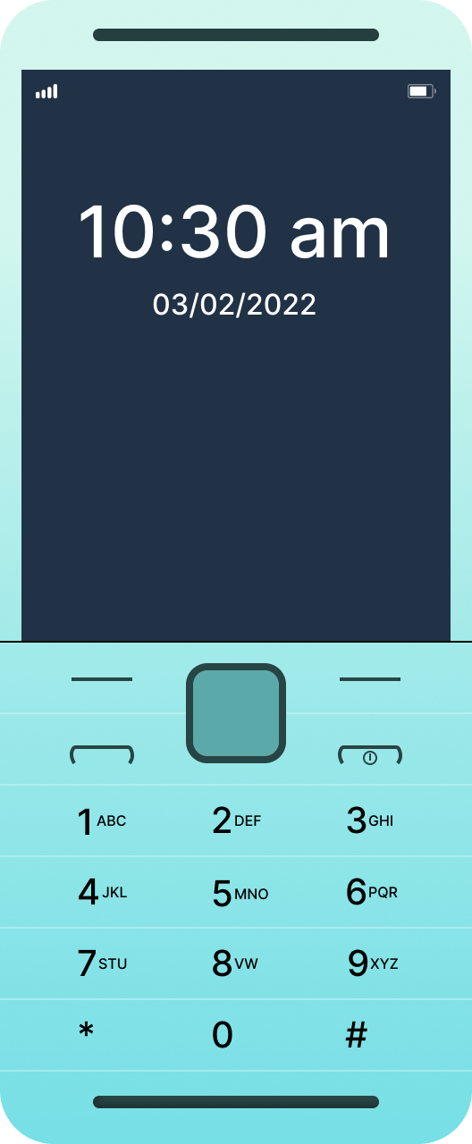
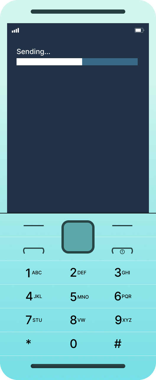
08 — USSD Flows
Financial access for every phone, not just smartphones
USSD is the most constrained design medium there is: no graphics, no back button, no persistent state, no error recovery UI — just numbered menus on a basic phone. For millions of users without smartphones or reliable data connections, it's the only interface that exists. Designing for USSD is an exercise in radical prioritisation.
Every menu was structured around the most common action first. Menu depth was capped at three levels — USSD sessions timeout, and every additional tap is a drop-off risk. Confirmation screens before any financial action protect users from fat-finger mistakes with no undo. Balance checks were accessible within two inputs from the root menu. Airtime and data top-up flows were streamlined to the minimum necessary steps — amount, confirm, done. The discipline of USSD design fed directly back into how we thought about efficiency in the mobile flows too.
Shortcode input — *723*1000#
Confirmation before debit — change provider or card
✓ Confirmation screen before every financial action
✓ Balance check in ≤2 inputs from root
✓ Always-available exit: 0 = back · 00 = main menu
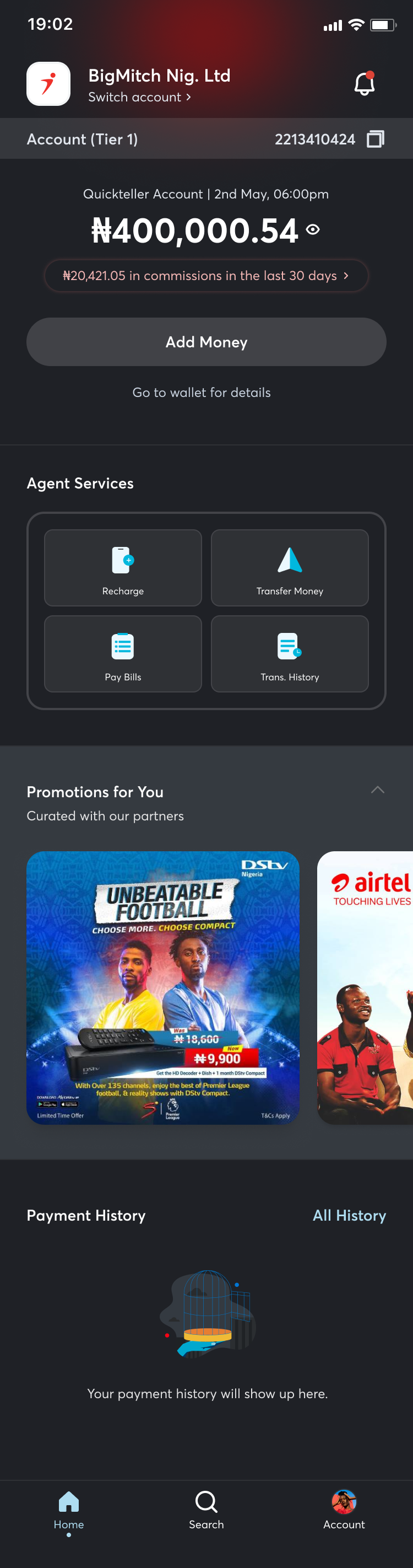
09 — Agent Dashboard
Designed for agents who process hundreds of transactions a day
Quickteller agents are operators — not casual users. They process payments on behalf of customers, often in high-volume, time-pressured environments. The agent dashboard needed to prioritise speed and accuracy above everything else, with an interface that felt more like a professional tool than a consumer app.
The dashboard surfaces transaction initiation front-and-centre — not buried behind a navigation menu. Recent transactions are visible immediately for reference and reconciliation. Commission tracking gives agents real-time visibility of their earnings without requiring a separate report. Clear transaction status indicators (processing, completed, failed) mean agents never have to guess whether a transaction went through before telling a customer. Error states were designed with specific recovery paths — because a failed transaction at a physical agent point is a customer standing in front of you.
Designed for operators
-
01
Balance & Commission
Account balance and commissions earned in the last 30 days — the two numbers that matter most to an agent, visible immediately on open.
-
02
Agent Services Grid
Recharge, Transfer Money, Pay Bills, Transaction History — the four core agent actions in a compact grid, always one tap away from any state.
-
03
Contextual Promotions
Partner offers surfaced below the fold — visible to agents browsing between transactions, without competing with the primary workflow.
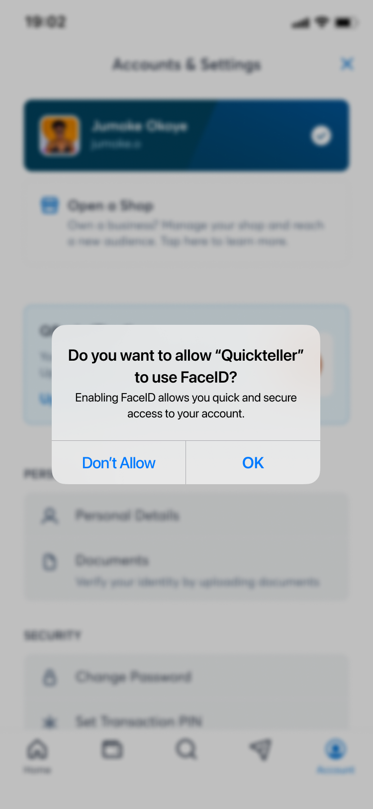
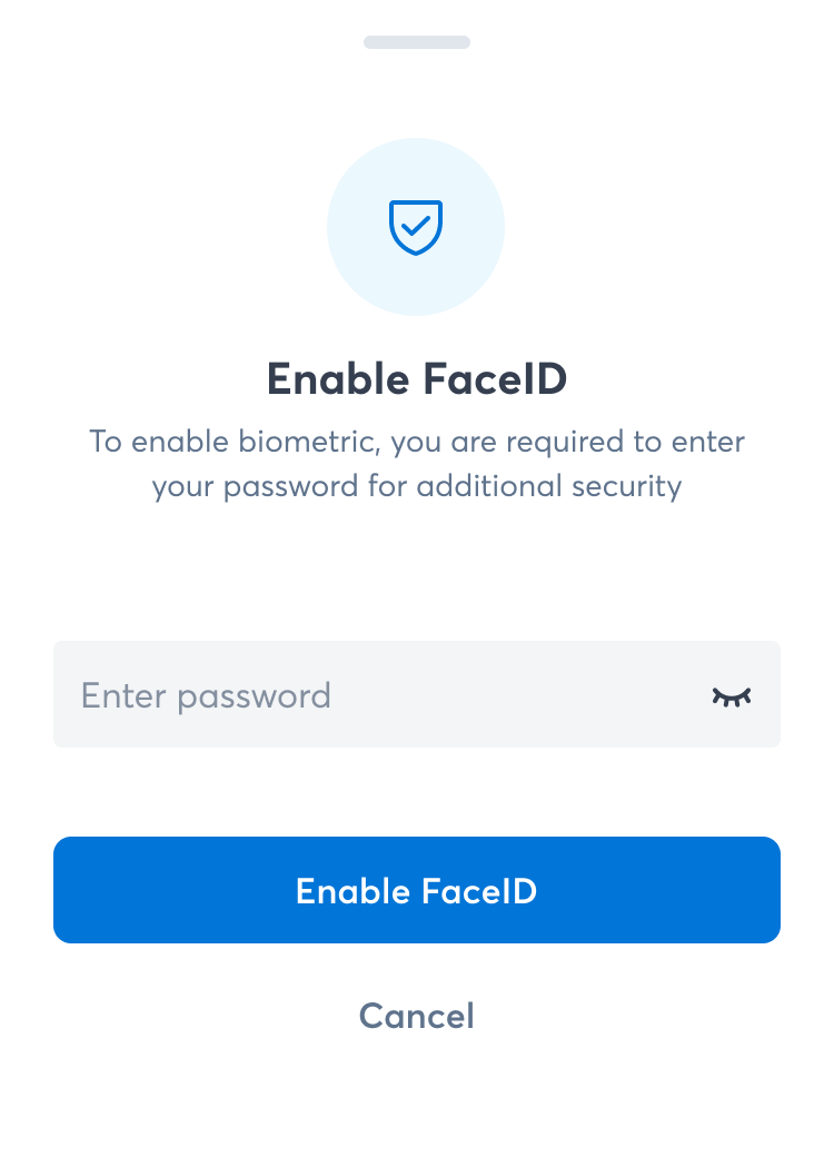
10 — Biometric Login
Security that doesn't feel like a barrier
For a financial superapp used multiple times a day, authentication friction compounds. Every extra second at the login screen is a reason to use a less secure shortcut — or not open the app at all. Biometric login had to be the fastest, most trustworthy path to the app, with a fallback that didn't punish users when biometrics failed.
The opt-in setup flow is framed around convenience, not security theatre — users are told what biometrics enables (faster access) rather than what it prevents. The authentication screen triggers the biometric prompt immediately on open, with PIN fallback one tap away. Clear failure states distinguish between a biometric mismatch and a device capability issue — users aren't left wondering if something is wrong with their account or their phone.
Enable FaceID — password verification step
iOS permission dialog — framed as quick access
11 — Additional Owned Modules
SDK Packages, Gift Cards, International Airtime, Money Market Fund
Beyond the six flows above, I owned the end-to-end design of four additional modules — each with distinct UX challenges and user contexts.
SDK Packages
Designed the developer-facing SDK integration experience — documentation entry points, package selection, and implementation guidance surfaced within the platform for businesses embedding Quickteller capabilities.
Web
Gift Cards
Purchase and redemption flows for digital gift cards — covering brand selection, denomination choice, personalisation, delivery, and recipient redemption across web and mobile.
Web + Mobile
International Airtime
Cross-border airtime top-up for international numbers — country and operator selection, number validation, denomination clarity, and transaction confirmation handling across different carrier formats.
Mobile
Money Market Fund
Investment product onboarding — presenting yield, liquidity, and risk information in plain language to users unfamiliar with money market instruments, with a clear path from education to investment action.
Web + Mobile
12 — Dashboard Collaboration
Information hierarchy for a superapp — three deliberate layers
I was an active collaborator on the Dashboard — not the sole designer, but a meaningful contributor to the information hierarchy decisions that shaped it. For a superapp with this many services, the risk is paralysis: too many entry points, no clear primary action, and users who never discover the features beyond the ones they already know.
The dashboard was structured around three deliberate layers, each earning its position based on frequency and urgency of use:
Layer 1 — Financial Overview: Account balance and recent activity. This is what users come for first — the answer to "what is my money doing right now." It had to be visible without scrolling and scannable in under two seconds.
Layer 2 — Quick Actions: Send, Pay, Top-up. The three most common transactional actions, permanently accessible from the home screen. Not buried in a menu, not requiring navigation — present and tappable.
Layer 3 — Service Discovery: Insurance, Loans, Travel, and the rest of the superapp ecosystem. Surfaced below the fold — important enough to be discoverable, but not competing with the core financial use case. The goal was ambient awareness, not aggressive promotion.
Three deliberate layers
-
L1
Financial Overview
Total balance, account number, Add Money and Send Money — the two highest-frequency actions. Visible without any scroll.
-
L2
Quick Actions
Airtime, Data, Electricity, Cable TV, Internet, Betting, Transport — most common bill payments, one tap from the home screen.
-
L3
Service Discovery
Investments, Insurance, Travel, Instant Loans — surfaced below the fold. Discoverable without competing with the primary use case.
-
+
Spend Insights
Monthly spend trend with a sparkline at the bottom — ambient financial awareness for users who want to go deeper.
13 — Full Collaboration Scope
10+ additional modules, across the full product surface
Across the Quickteller rebirth, I was an embedded contributor on the following modules — working alongside their module leads, contributing to design reviews, user testing, and iterations.
Send Money
Quickteller Account (Mkudi)
Rewards
Insurance
Loans
Travel
Energy
Insights
Save & Invest
Dashboard
14 — Design Audits
Closing the gap between design intent and shipped product
Design doesn't end at handoff. Across the Quickteller project I conducted repeated audits of implemented features — comparing what shipped against what was designed, documenting deviations, and translating findings into clear recommendations for engineering teams, the business, and senior stakeholders.
01
Implementation vs. design fidelity reviews
Systematic comparison of implemented screens against design specs — capturing spacing deviations, colour inconsistencies, interaction gaps, and missing states that slipped through engineering review.
02
Stakeholder-ready findings documentation
Audit findings were packaged into structured reports — prioritised by severity, with clear before/after comparisons and specific remediation recommendations. Distributed to engineering, product, and business teams.
03
User testing on implemented flows
Ran user testing sessions on both owned and collaborated modules post-implementation — validating whether the shipped product delivered the intended experience, and feeding findings back into the design iteration cycle.
04
Cross-team design quality advocacy
Audit work reinforced design quality as a shared responsibility — not a hand-off event. Maintained ongoing dialogue with engineering leads to address systemic issues rather than one-off fixes.