UX Case Study · Fintech · iOS & Android
A full product redesign that transformed a recalled investment app into a wealth super-app — generating ₦2BN+ in revenue post-launch.
01 — Overview
M36 is an investment and lifestyle app designed to help Nigerians create, grow, manage, and preserve wealth on their own terms. First released in 2019, it gained solid download traction but suffered from critically low retention. The app was recalled in 2021 to find out why — and rebuild from the ground up.
The core problem remains critical: investment is far from the average Nigerian's reality. M36 was built to change that — letting anyone invest from ₦50,000, while layering in lifestyle services that make everyday money management seamless.
02 — The Problem
Before touching any design tool, I conducted a full heuristic evaluation of the existing product. The issues weren't cosmetic — they were structural, creating friction at every critical user touchpoint.
03 — User Research
I used both qualitative (1-on-1 call interviews) and quantitative (surveys) methods. 119 participants responded with unusually high engagement. Research focused on three goals: understanding pain points, testing awareness of M36's core value, and validating appetite for the super-app direction.
04 — Project Timeline
05 — Heuristic Evaluation
| Heuristic | Finding | Severity | Fix |
|---|---|---|---|
| System Feedback | Login, wallet funding, BVN, OTP failures — no readable error states | Critical | Rebuild all feedback states; human-written error messages |
| Error Recovery | Generic technical errors — users had no recovery path | High | Clear, plain-language errors with specific next steps |
| Navigation | 76% couldn't find key features — ambiguous labels and IA | High | Full IA restructure; nav redesigned for target user model |
| Help & Support | 2 in 6 users couldn't reach support or got no response | Medium | Self-service FAQ + blog alongside human support channels |
| Session Mgmt | Sudden mid-flow timeouts, no warning | Medium | Extended sessions; timeout warnings before expiry |
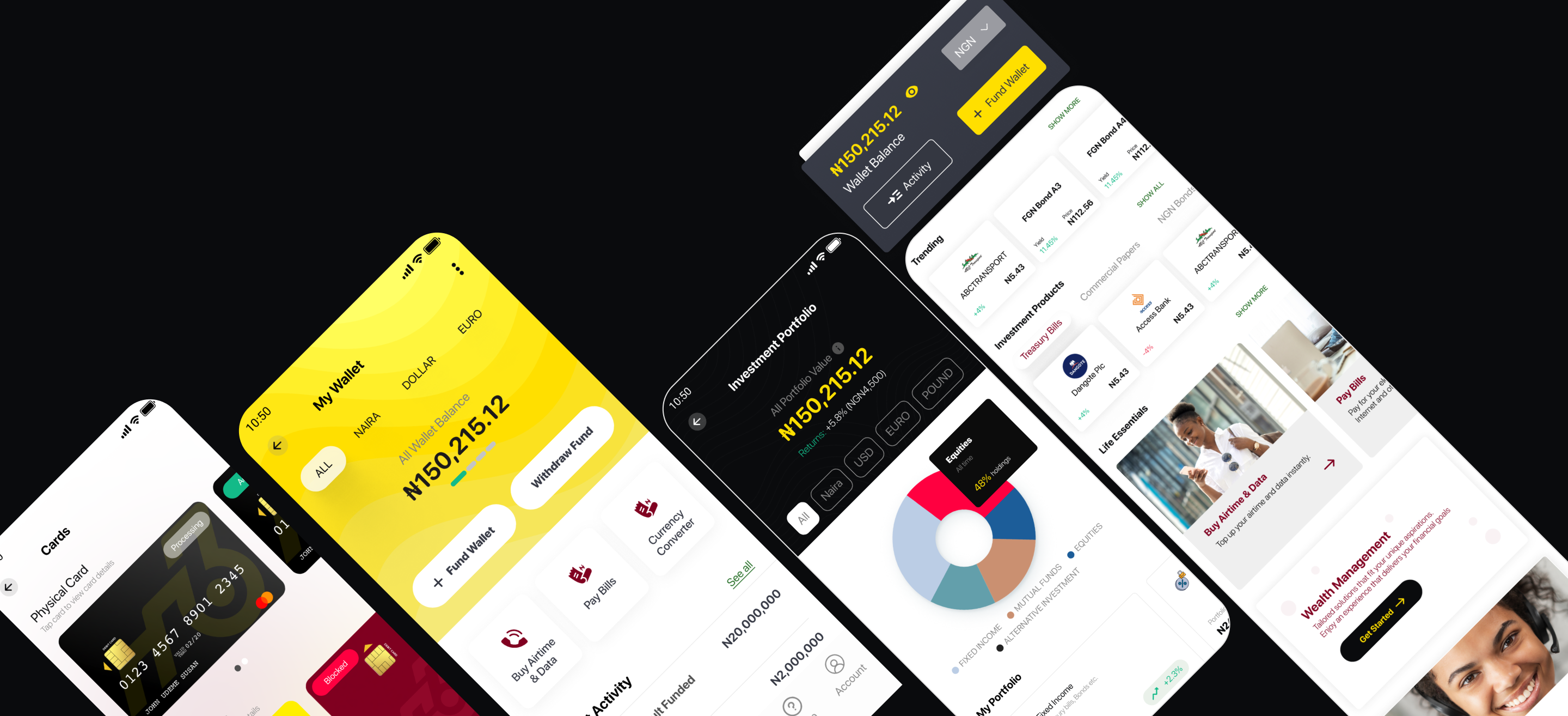
06 — Before & After
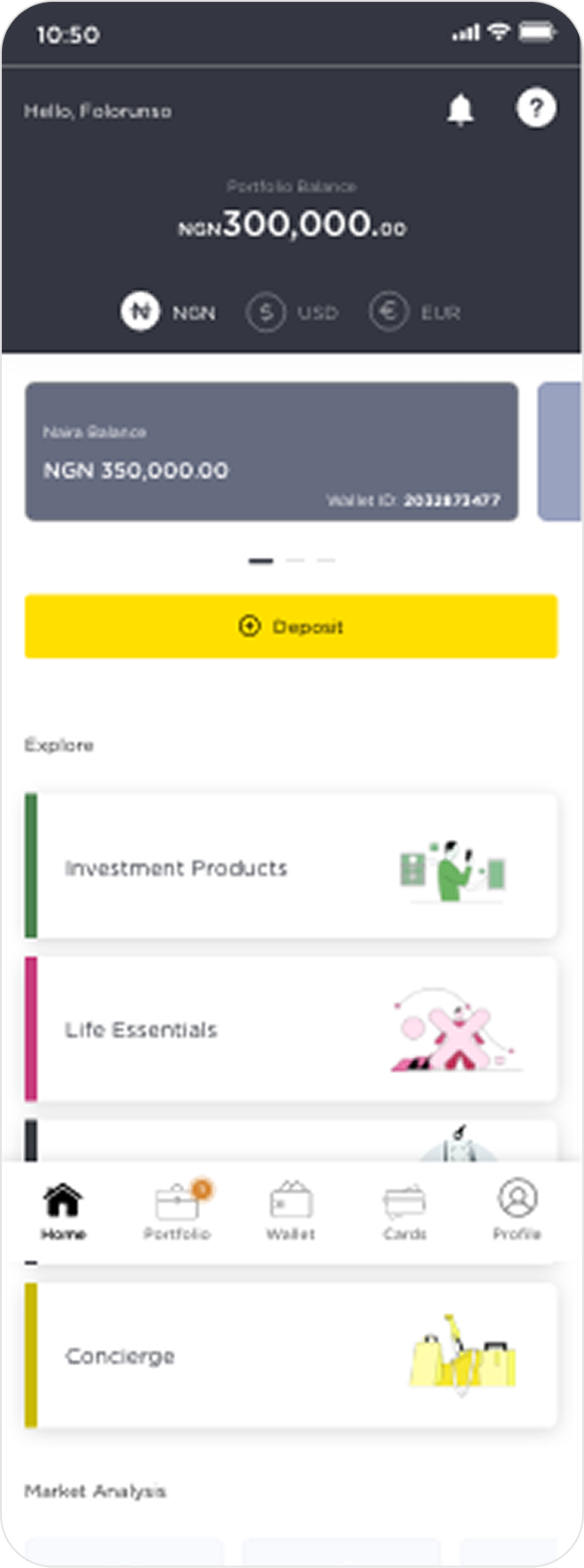
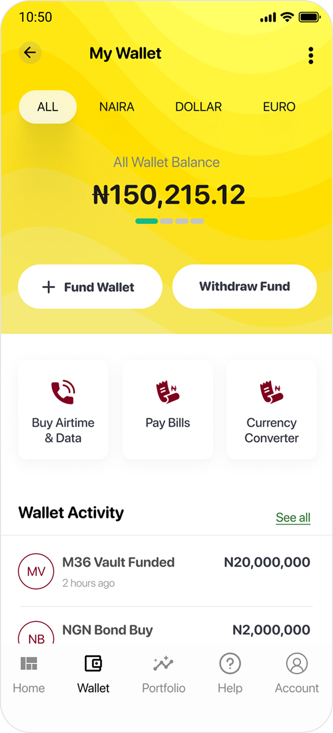
The home dashboard was the biggest single transformation. The old version buried every action under ambiguous category cards with no clear financial hierarchy. The new version leads with a dark wallet card showing live balance, surfaces trending investments immediately, and structures lifestyle services within a single clean scroll.
Confusing hierarchy. Users couldn't distinguish portfolio balance from wallet balance. Navigation scattered. No clear call to action.
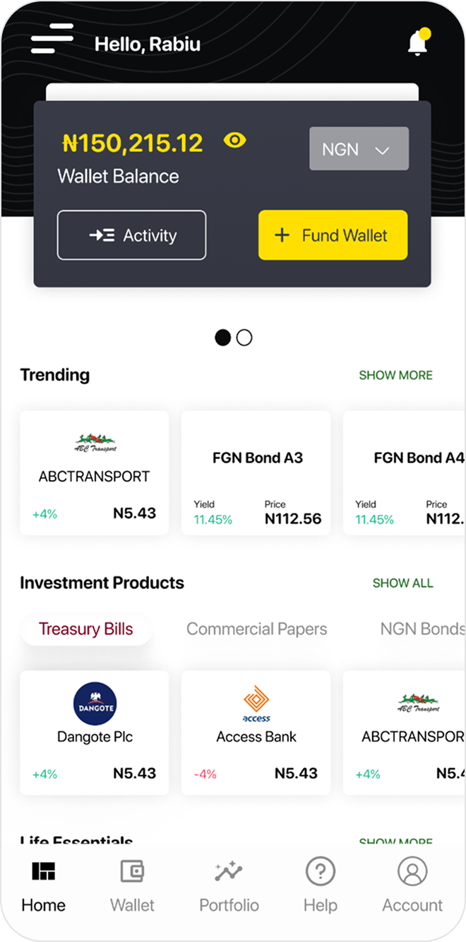
Clear wallet card. Currency toggle. Trending investments surfaced immediately. Life Essentials accessible within one scroll. Logical bottom nav.
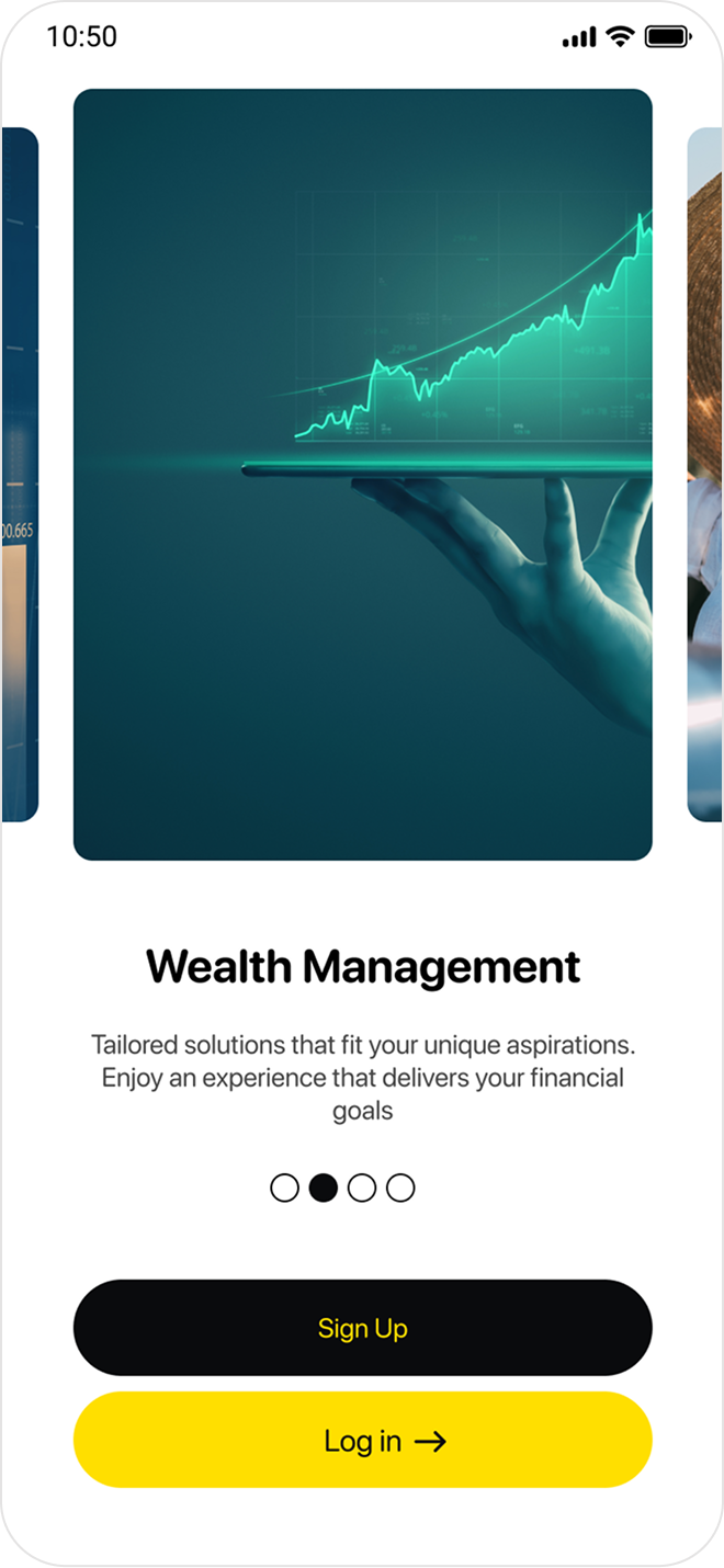
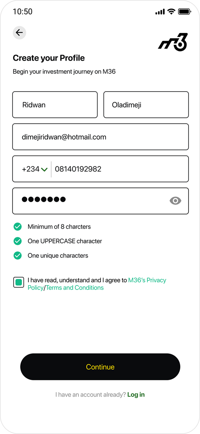
07 — Onboarding Flow
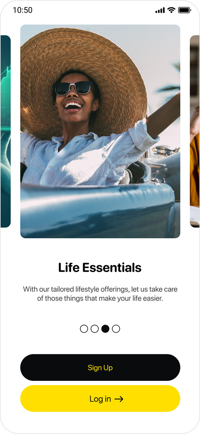
The original onboarding was cold and form-first, offering no reason to trust the app before asking for personal details. The redesign opens with a visual story — Wealth Management, then Life Essentials — letting the product's value land before the signup form appears.
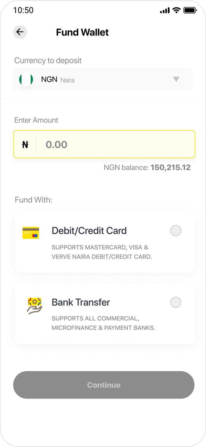
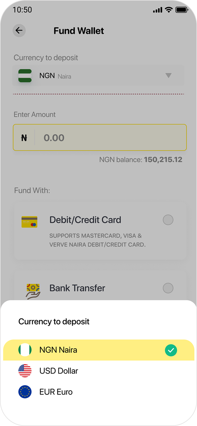
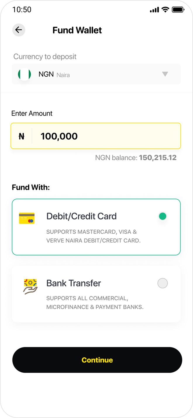
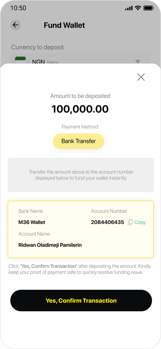
08 — Wallet & Funding Flow
Wallet funding was the single highest drop-off point in the old app. The redesign introduces a bold, multi-currency yellow wallet screen, followed by a clean 4-step funding flow — supporting debit/credit card, bank transfer, and currency selection. Every step was designed to communicate trust and forward momentum.
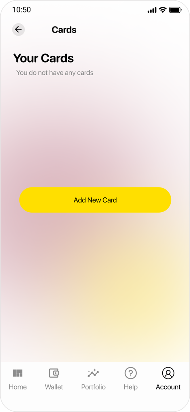
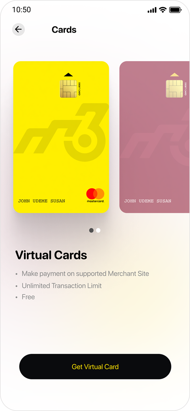
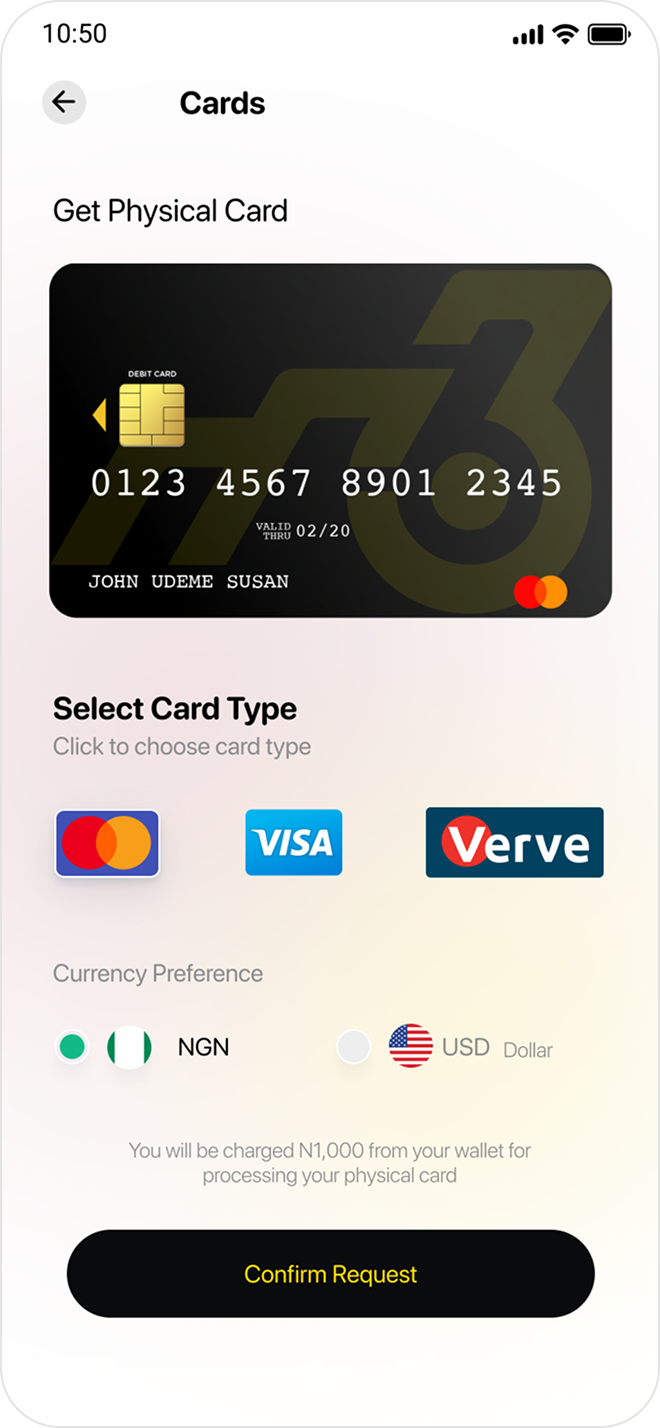
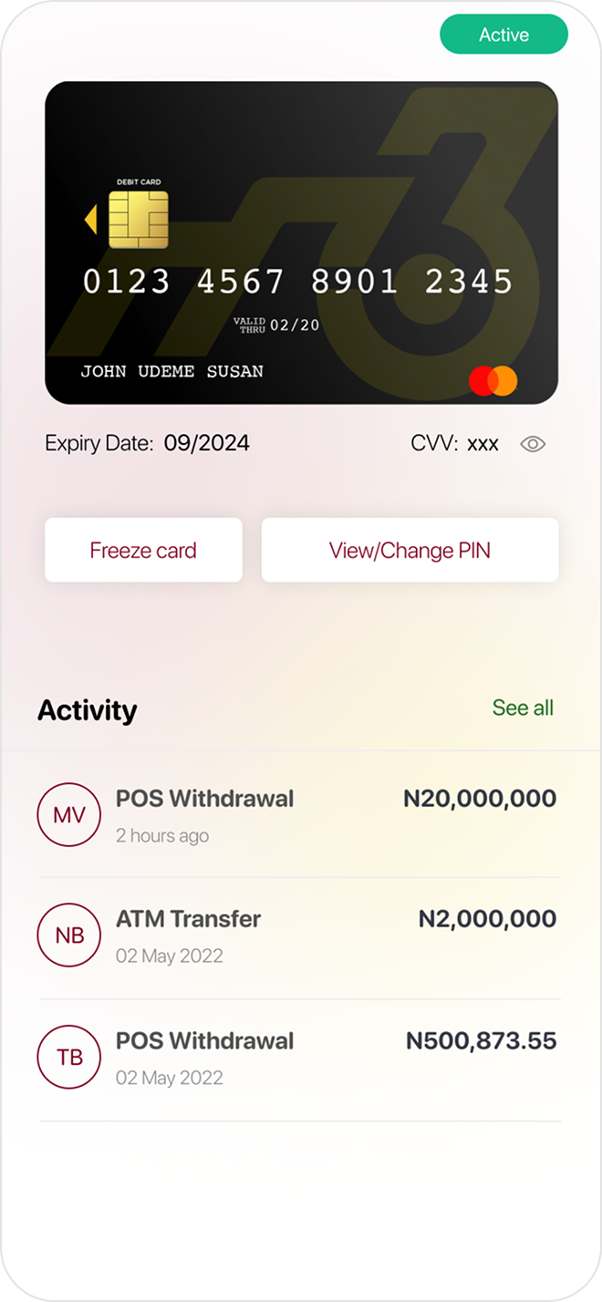
09 — Cards Flow
Cards was a brand-new feature addition. Users can request a free virtual Mastercard instantly, or order a physical card for ₦1,000 — choosing from Mastercard, Visa, or Verve, in NGN or USD. The flow moves from empty state → card selection → confirmation → active card management, with a tactile card-focused visual language throughout.
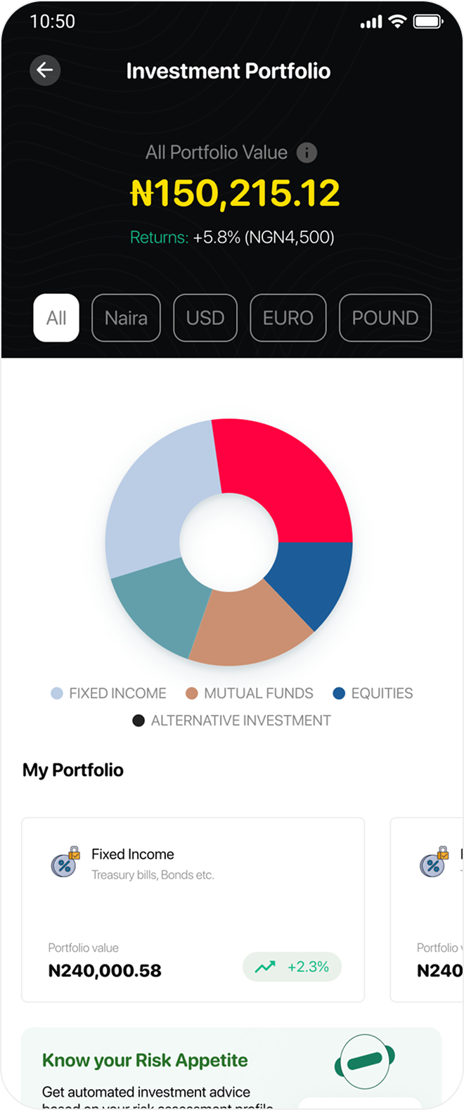
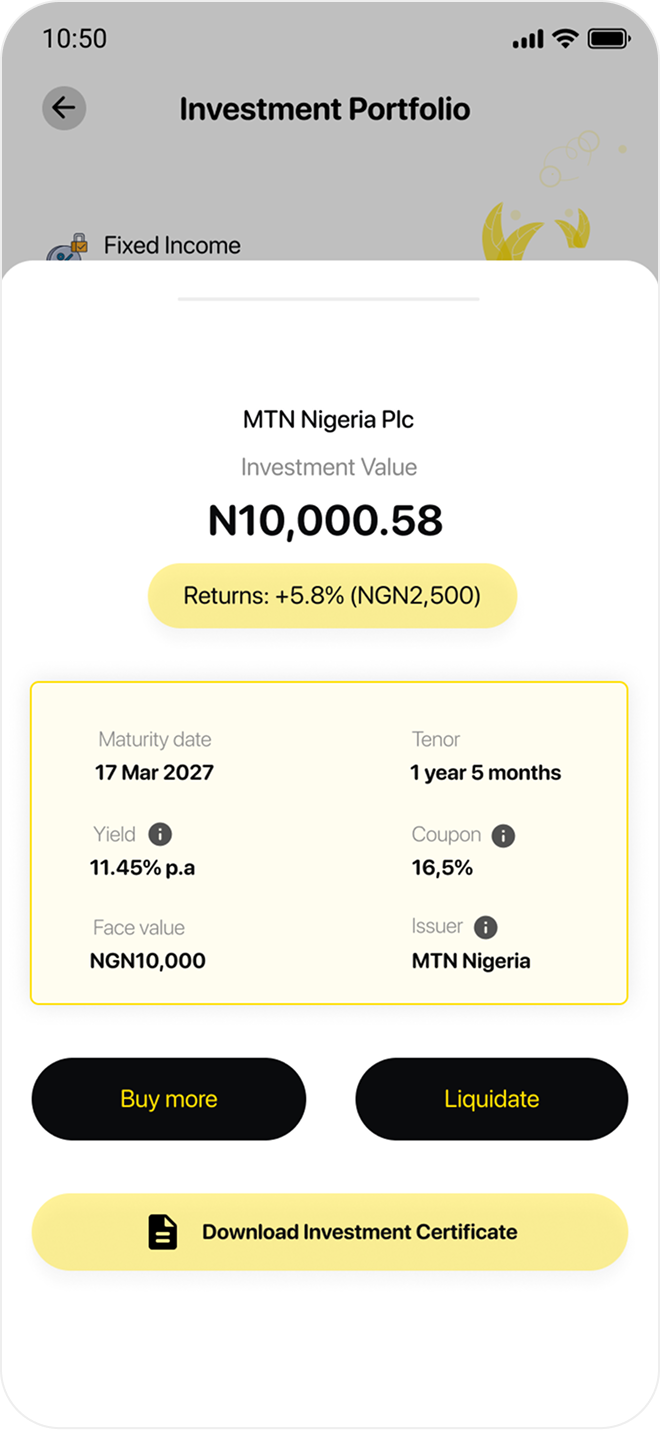
10 — Investment & Portfolio
The portfolio screens were rebuilt from scratch. The overview opens with a dark-branded header showing total portfolio value and live returns, with a donut chart breaking down allocations across Fixed Income, Mutual Funds, Equities, and Alternative Investments. Drilling into an individual holding reveals maturity date, yield, coupon rate, face value, and issuer — all scannable in seconds.
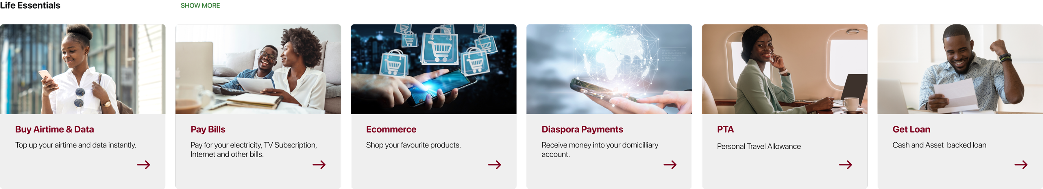
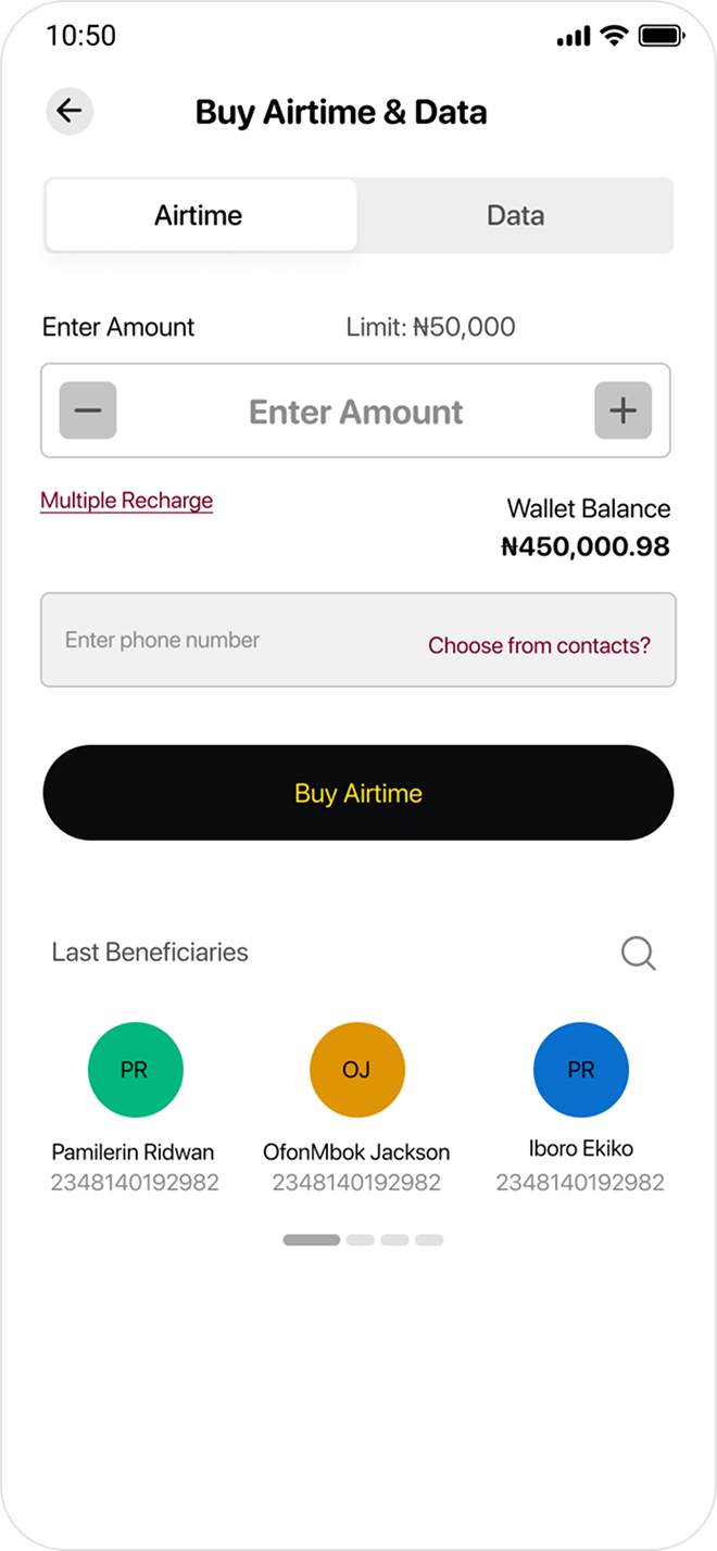
11 — Lifestyle Super-App
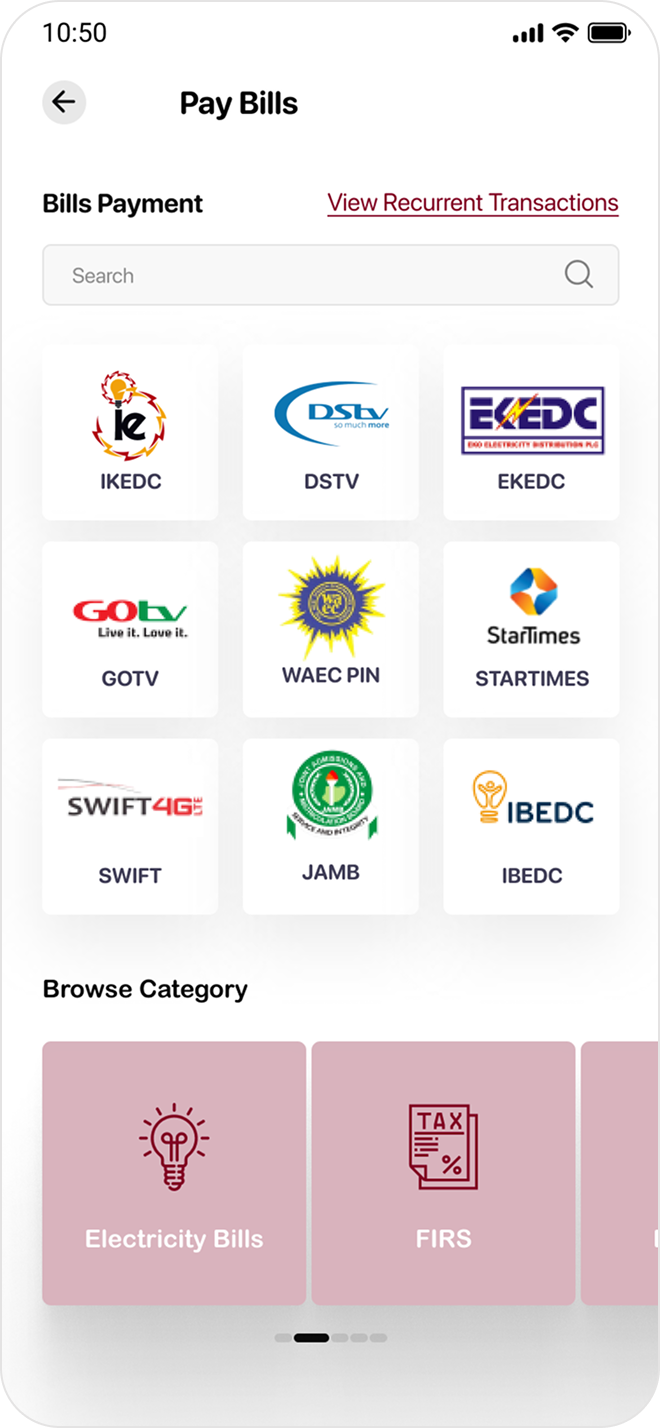
The biggest strategic shift in the redesign: M36 became a financial super-app. Life Essentials surfaces six utility services — Airtime & Data, Pay Bills, Ecommerce, Diaspora Payments, PTA, and Loans — directly from the home dashboard. Each service has its own focused, polished flow.
12 — Impact
"The problem with the original M36 wasn't the idea — it was that the experience made investing feel harder, not easier. People already fear finance. The redesign had to make the app feel like it was on their side."