UX Case Study · Healthtech · Mobile + Web · 0→1 Product
A three-platform health & wellness marketplace for Nigeria — a consumer mobile app, a vendor management portal, and a super-admin dashboard. Designed from zero to connect users with fitness, nutrition, diagnostics, and self-care vendors in one seamless experience.
01 — Overview
Healthbanc is a wellness marketplace built for the Nigerian market — a single destination for booking fitness programs, ordering healthy meals, accessing diagnostic services, and managing self-care. Unlike generic health apps, Healthbanc treats wellness as a financial product: users hold a wallet, earn rewards, unlock deals, and make seamless payments — all in one place.
As Lead Product Designer, I owned end-to-end design of all three platforms from discovery through developer handoff: the consumer mobile app, the vendor management portal, and the super-admin dashboard.
02 — The Challenge
Nigeria's wellness industry is deeply fragmented. A user wanting to "stay healthy" might visit three different apps just to book a gym, order a meal plan, and schedule a diagnostic. There was no unified product. Healthbanc's ambition was to fix that — but the design challenge was significant: how do you personalise a marketplace, make payments feel native, and build trust with vendors and users simultaneously, across three completely different surfaces?
03 — First Impressions
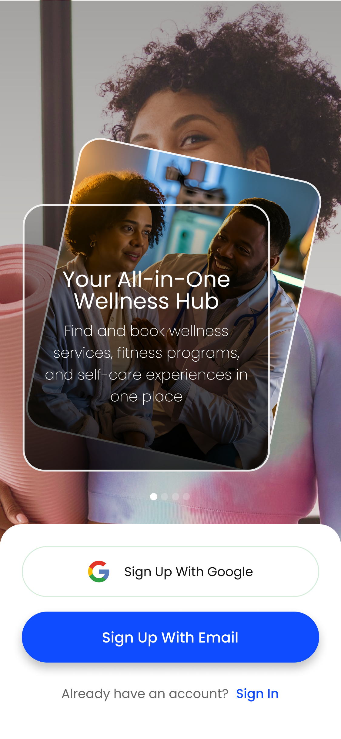
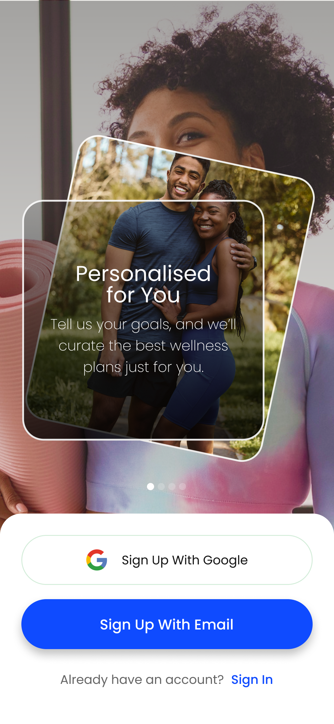
The splash sequence had one job: earn trust before asking for anything. Each slide leads with a full-screen lifestyle image — real people, Nigerian context — with a floating card overlay naming the value proposition directly. No corporate language, no feature lists. Three ideas: Your All-in-One Wellness Hub, Personalised for You, Seamless & Rewarding.
Sign-up is minimal by design. Google OAuth removes friction for the majority; email sign-up handles everyone else. The "Already have an account? Sign In" link sits quietly below — never competing with the primary conversion action.

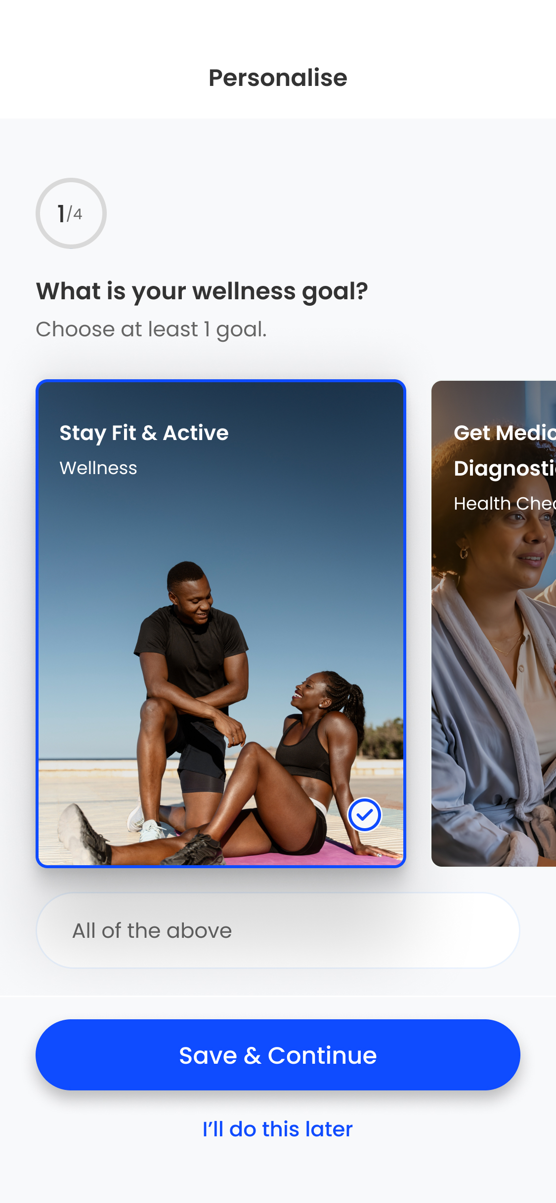
04 — Account Creation & Personalisation
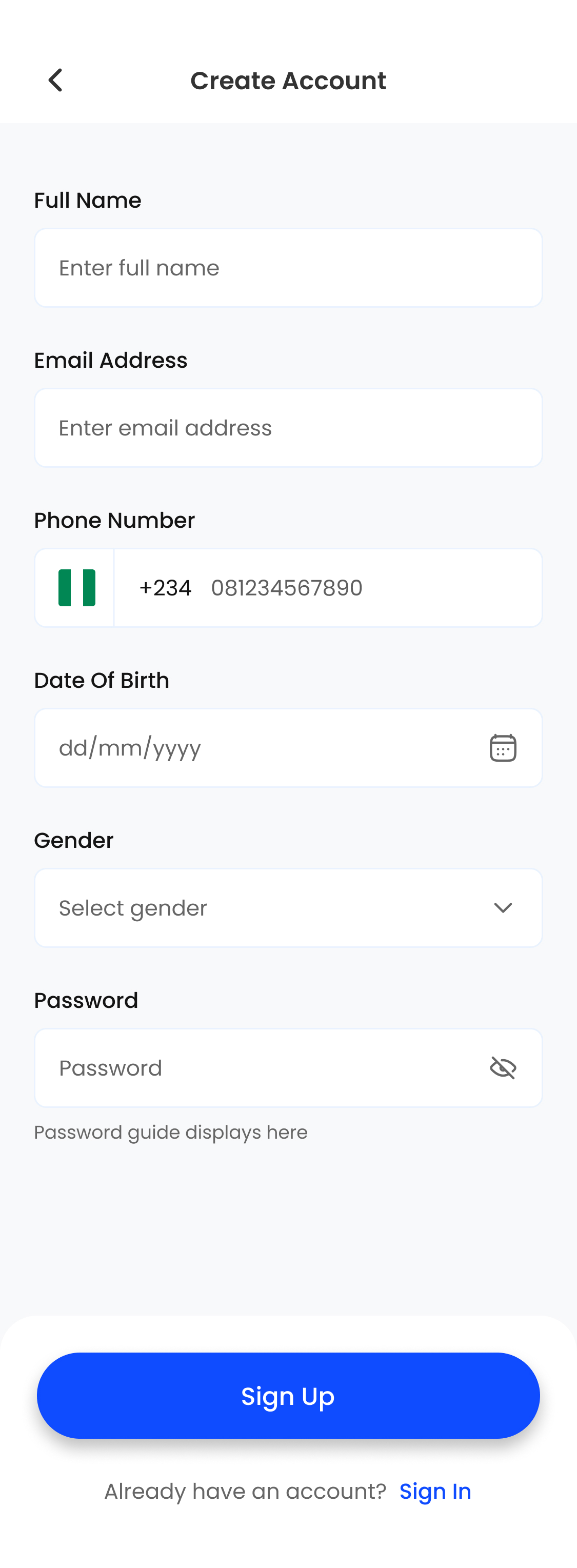
The Create Account form is a single-page layout. Fields are ordered by cognitive effort: name and email first, then phone with a Nigerian flag and +234 pre-filled, then date of birth, gender, and password last — mirroring how Nigerians naturally share personal information in order of sensitivity.
Wellness goal personalisation (step 1 of 4) immediately follows registration — turning account creation into purpose-setting and making the app feel curated from day one. Image-driven goal cards with a blue border and checkmark selected state make multi-selection feel expressive, not clinical.
05 — Home Dashboard
The home screen opens with a wallet card — full-bleed, branded blue-green, displaying the account number and total balance. By showing money first, Healthbanc signals it's a financial product, not just a health directory. The wallet card creates a mental model of spending power before any browsing begins.
Below the wallet, four quick-action icons (Shop, Cart, Deals, Rewards) reduce tap depth for the most common actions. "Curated Just For You" drives personalisation adoption. "Speak to an Expert" surfaces Fitness Trainers and Dieticians with photography that makes the service feel premium. Wellness Reminders at the bottom creates a habit-forming loop that brings users back even when they're not purchasing.
06 — Discovery & Product Detail
The "Curated For You" screen is the payoff for completing onboarding. Category filters (Diagnostics, Fitness, Healthy Meals) sit as scrollable pill chips — lightweight navigation that never forces users into a deep category tree. Product cards use generous imagery, vendor name badges, star ratings, and a yellow "50% OFF" callout pill that creates urgency without desperation.
The product detail page handles service complexity gracefully: a "Choose start date" field and optional add-ons (Adult Registration Fee, Children Registration Fee) — without overwhelming the primary purchase action. A sticky bottom bar with price, quantity stepper, and cart icon keeps conversion always visible.
07 — Checkout & Order Confirmation
The checkout screen eliminates the biggest friction point in mobile commerce: the delivery address. Saved addresses (My Home, My Office) appear as selectable radio cards — users don't type unless they need to. Phone is pre-filled from the account profile. Payment method selection (Wallet with live balance, Card, Bank Transfer) uses simple radio-style cards with no dropdowns or modals.
The order confirmation screen uses the full-screen success pattern — a green checkmark, the order number, and a health-themed background illustration that communicates completion clearly. Two exit paths: Continue Shopping (secondary) and Done (primary).
08 — Wallet & Transactions
The wallet screen is where Healthbanc's "health as finance" positioning crystallises. The wallet card — blue-green gradient, account number, total balance, eye-hide toggle — mirrors the visual conventions of Nigerian digital banking apps (Opay, Kuda, PiggyVest) deliberately. Users already know this pattern. Transaction history is filterable across All / Money In / Money Out tabs, with each transaction showing vendor name, date, time, and colour-coded amount direction.
09 — Admin — Overview Dashboard
The super-admin dashboard is a fundamentally different product from the consumer app. Its primary job is performance monitoring — giving the Healthbanc operations team a live view of platform health. Four KPI cards lead: Total Users (37,000), Total Purchases (4,240), Total Revenue (₦37M), and Total Income (₦3.04M) — each with a week-on-week delta and trend arrow. The Top 10 Selling Products table below gives merchandising teams the signal they need to act on ranking, category, vendor, and revenue.
10 — Admin — Vendor Management
The Vendors section is the operational heart of the admin platform. Three stat cards at the top (300 Total, 280 Active, 20 Inactive) give the operations team their vendor health metric at a glance. The table shows Name, Category, Date Onboarded, No. of Products, No. of Sales, and Status — everything needed to audit a vendor's performance in a single row, without opening a detail view.
Status is an inline dropdown rather than a separate edit screen — admins change vendor status without leaving the table, reducing a high-frequency operational task from 4 interactions to 1. Pagination handles 1,700+ vendor records.
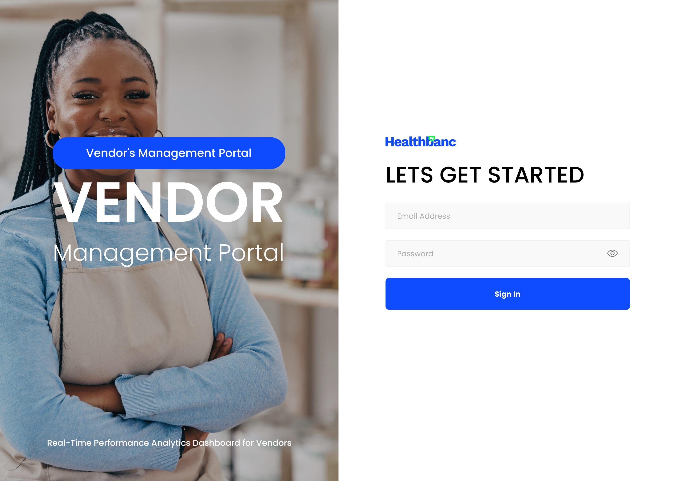
11 — Vendor Portal — Login
The vendor login page uses a split-screen layout — full-bleed lifestyle photography on the left, clean sign-in form on the right. The left panel does brand work: large "VENDOR" typography, a portal badge, and the sub-line "Real-Time Performance Analytics Dashboard for Vendors" — telling vendors exactly what they're accessing before they type a single character.
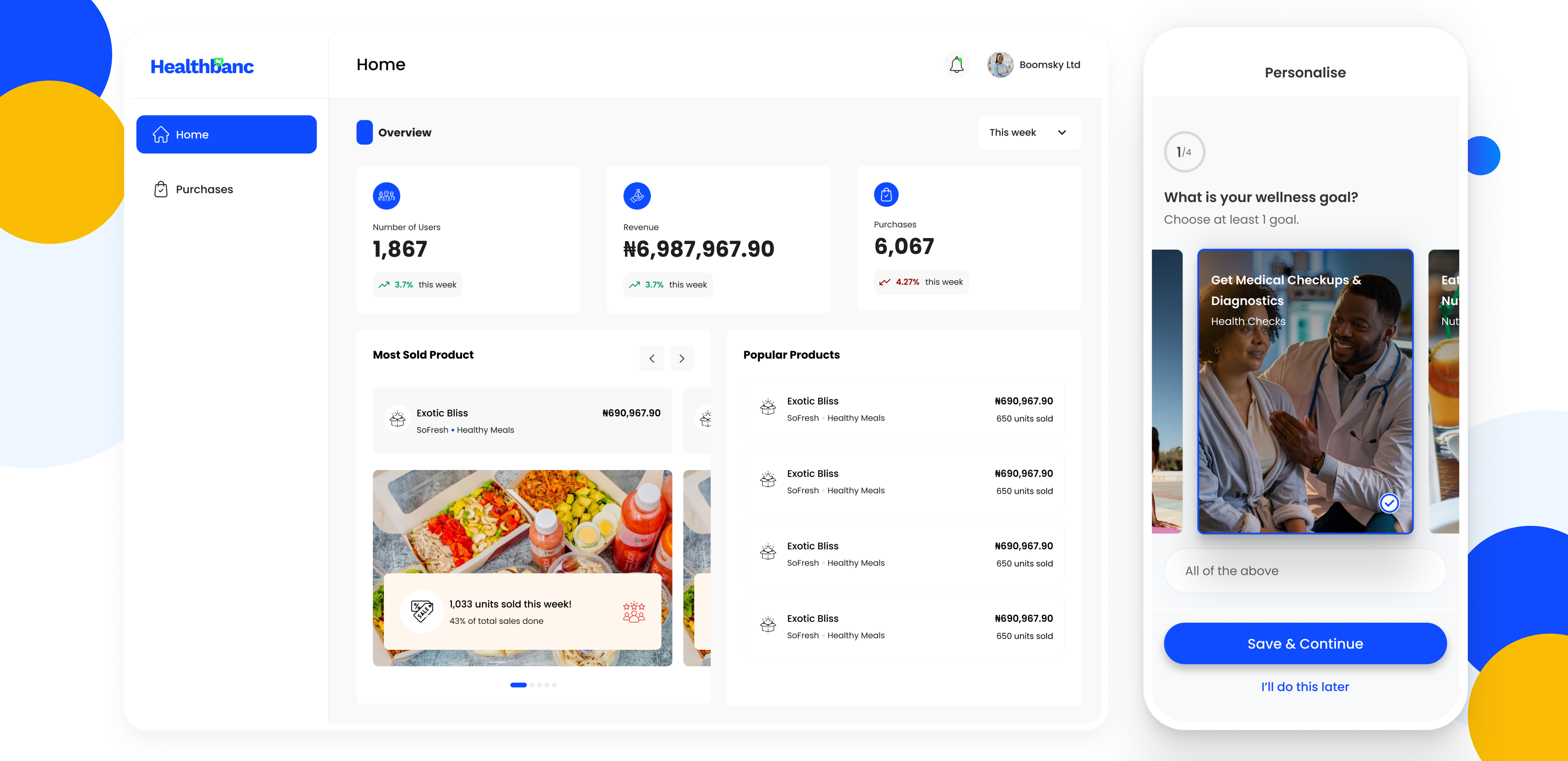
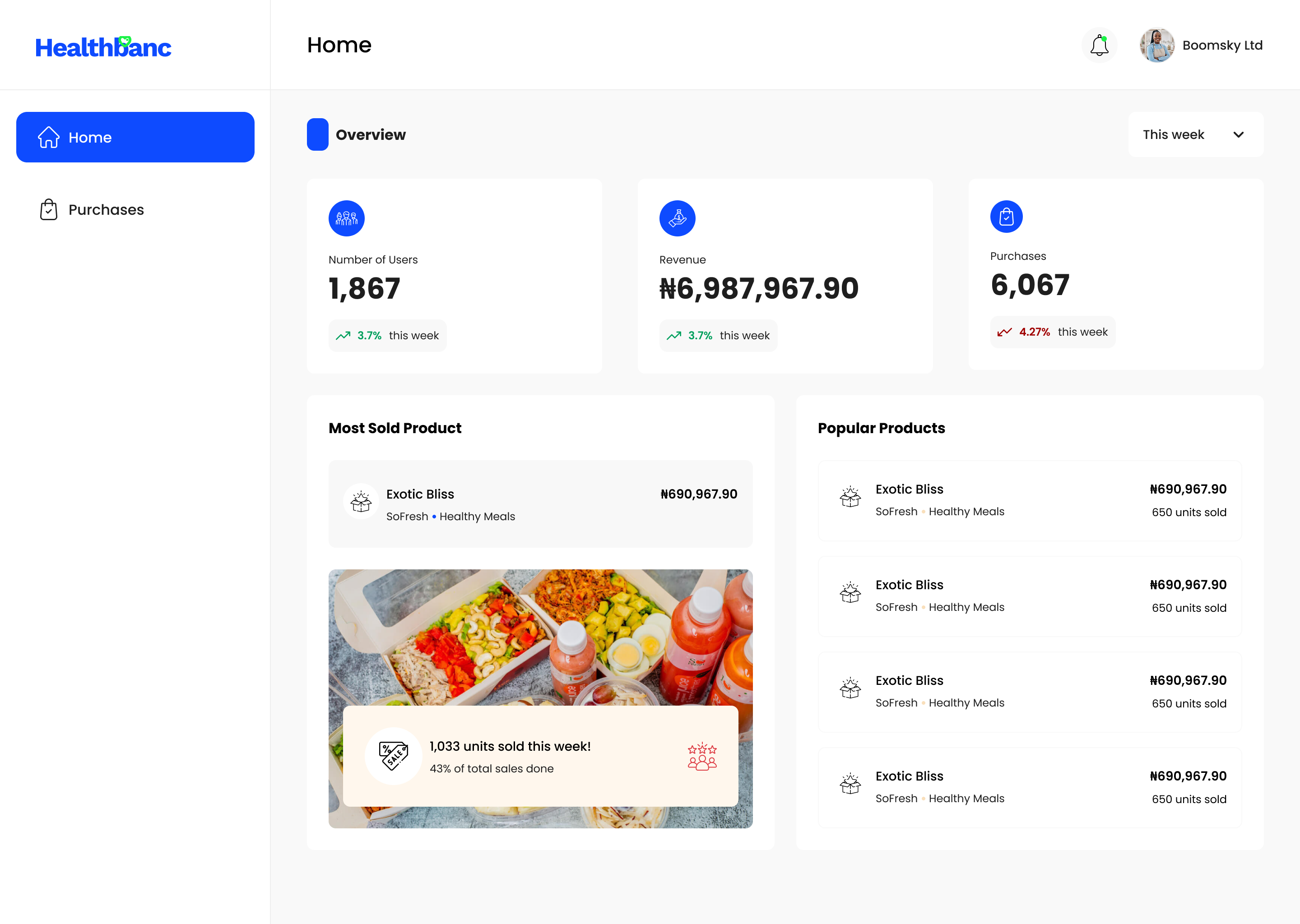
12 — Vendor Portal — Analytics Dashboard
The vendor home dashboard is deliberately stripped to its core. Three KPIs (Users: 1,867 | Revenue: ₦6.98M | Purchases: 6,067) give vendors their weekly performance at a glance. The "Most Sold Product" panel goes deeper: a hero product image, unit count ("1,033 units sold this week!"), and percentage of total sales — the exact signal needed to reorder or promote. Popular Products on the right provides a ranked table of top performers.
13 — Design System
| Element | Decision | Rationale |
|---|---|---|
| Wallet card — blue-green gradient | #2563EB → #0a5c6e across all wallet surfaces | Borrows from Nigerian fintech conventions (Kuda, Opay) — users already trust this visual language for money, reducing cognitive load for a new product category |
| Dark navy admin sidebar | #0b1929 deep navy for all admin navigation panels | Creates strong visual separation from content — admins always know they're in the navigation layer, not the data layer, without reading labels |
| Blue pill CTA everywhere | #2563EB rounded pill for all primary actions across all three platforms | Single accent for primary actions across all surfaces — regardless of which platform a stakeholder views, the CTA is instantly recognisable |
| Status badges — Active / Inactive | Green / Red pill badges in vendor and admin tables | Traffic-light convention needs no learning curve — operational users can scan status across hundreds of rows without reading text |
| Photography-first product cards | Full-bleed imagery with vendor badge and text overlay on mobile | Wellness is aspirational — people in context (fitness, food, healthcare) convert better than icon-based cards in a marketplace environment |
| Split-screen vendor login | Photography left, form right on all desktop breakpoints | Visually distinguishes the vendor portal from the admin portal while reinforcing "professional analytics tool" positioning at the moment of highest vendor intent |
14 — Impact
"The hardest part of designing Healthbanc wasn't any single screen — it was maintaining coherence across three products built simultaneously for three completely different users. The wallet card that anchors the consumer app had to feel at home on a marketplace, not just a bank. That tension between health and finance is what Healthbanc is built on — and it's what every design decision tried to honour."