UX Case Study · Legaltech · Web + Mobile · 0→1 Product
A dual-platform legal management system — a mobile app for clients to book consultations and track cases, and a web portal for lawyers and administrators to manage caseloads, billing, and teams. Designed from zero for an international law firm.
01 — Overview
Eversage Law Practice needed to bring international-grade legal services to Nigerian clients through technology — without sacrificing the trust, professionalism, and gravitas the legal industry demands. The result is a dual-platform system designed for two fundamentally different users with almost no workflow overlap.
02 — The Challenge
The core tension in designing for a law firm: legal interfaces need to feel authoritative and precise, but accessible to users navigating a high-stakes situation for the first time. The Eversage brand — deep greens, serif type, a tree emblem — set the visual tone. The UX had to honour that authority while remaining genuinely usable.
On the operational side, the lawyer portal faced a completely different challenge: surfacing 400+ consultations, 24 cases, and 389 clients in an interface that required no training.
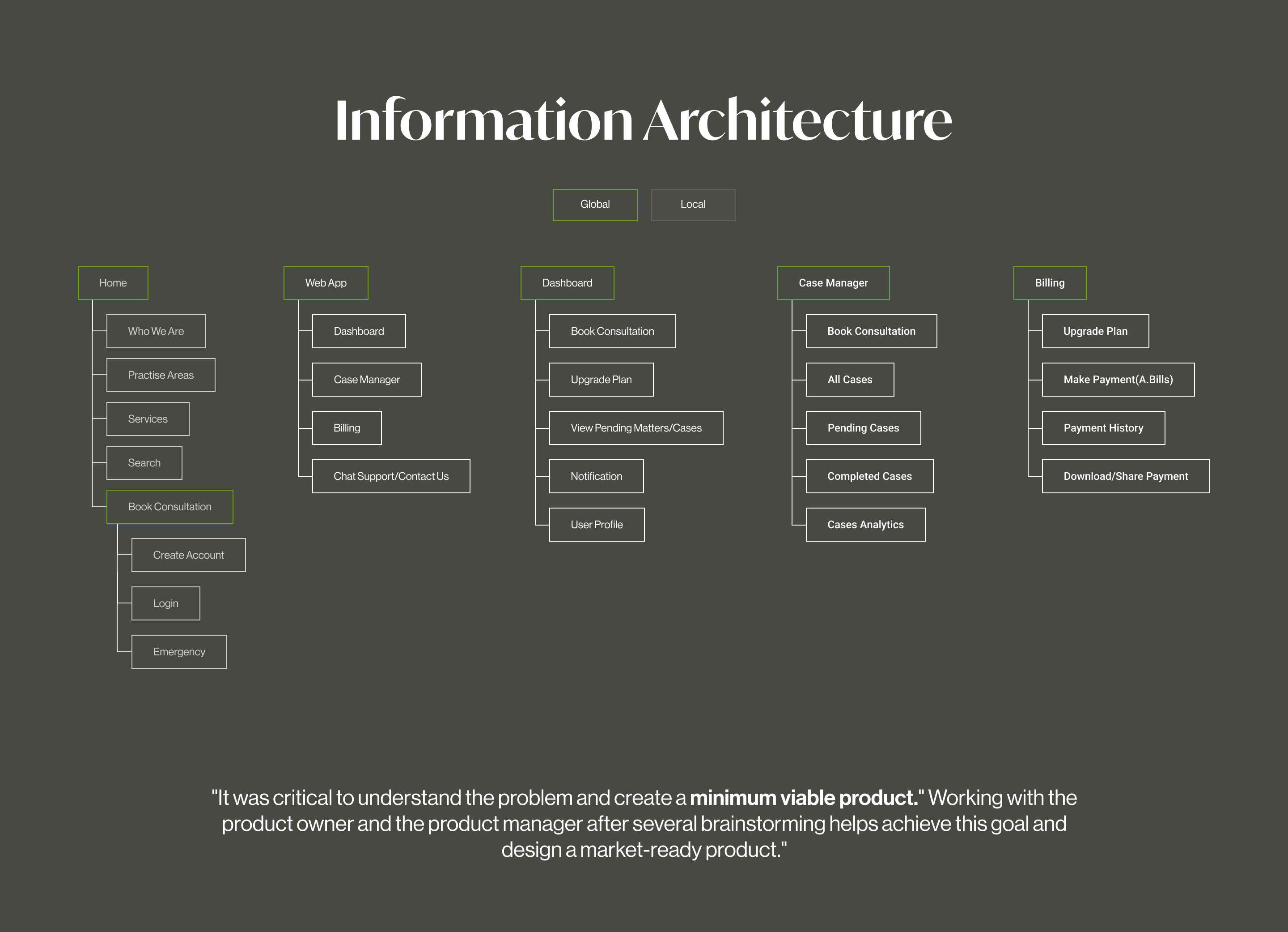
03 — Information Architecture
Before any visual design began, the full information architecture was mapped across both platforms — from the public-facing marketing site through to the lawyer admin portal. Five distinct surface areas emerged: Home, Web App (client), Dashboard, Case Manager, and Billing. This clarity prevented scope creep and ensured both platforms shared a coherent data model from the start.
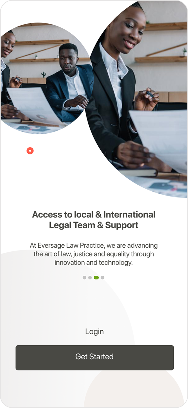
04 — Mobile Onboarding
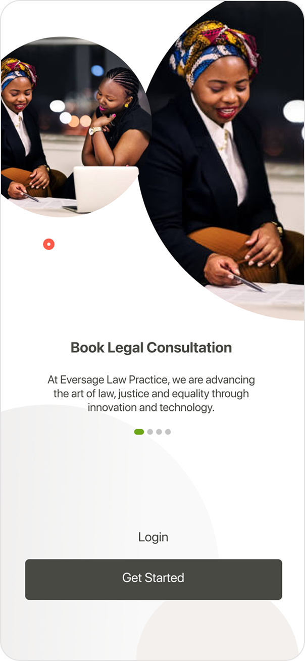
The onboarding opens with a deliberate visual choice: real photography of professional Black women in legal settings, not stock illustrations. Slides lead with the product's value proposition — "Book Legal Consultation" and "Access to local & International Legal Team" — before asking users for anything. The splash screen uses the Eversage tree emblem on a clean light background, establishing brand identity before any interface appears.
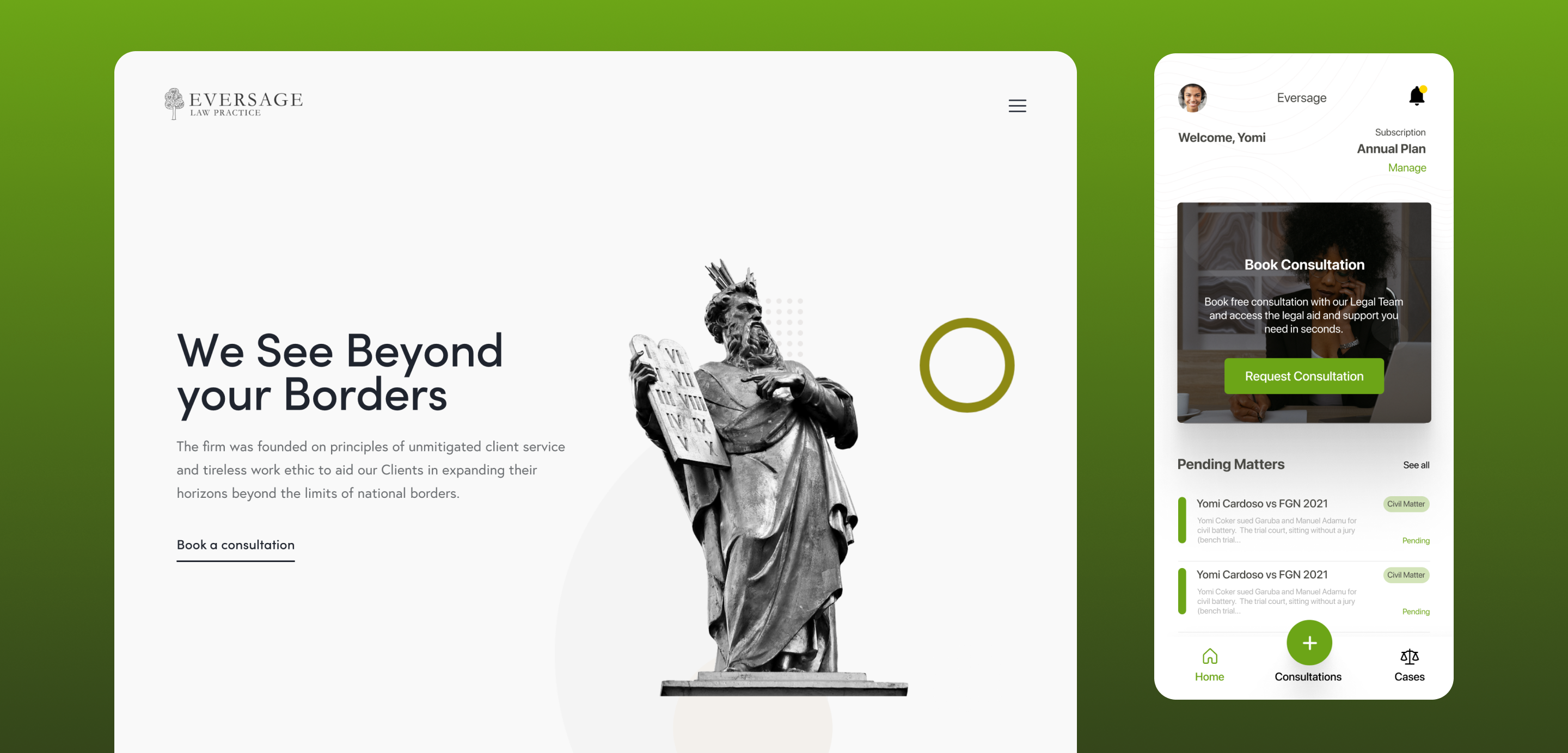
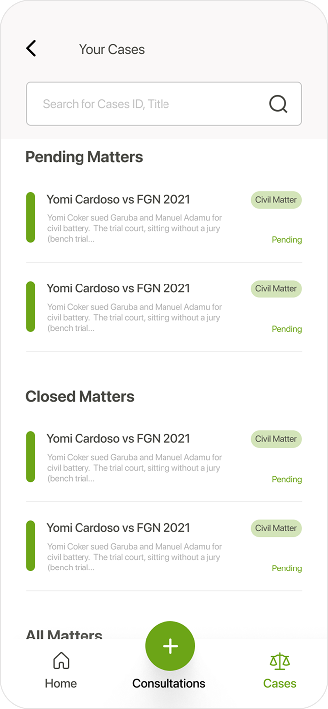
05 — Client Mobile Dashboard
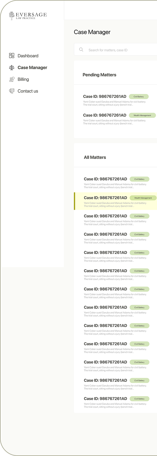
The mobile dashboard surfaces three things immediately: the user's total amount due, a prominent "Book Consultation" banner with photography, and a list of pending legal matters with status tags. The three-tab bottom navigation (Home, Consultations, Cases) keeps core flows permanently accessible. The "Your Cases" screen groups matters by Pending and Closed, with a global search bar and case category tags for fast scanning.
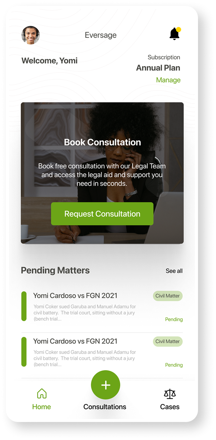
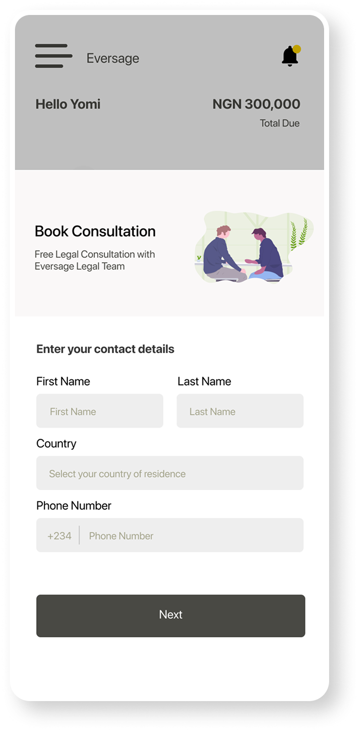
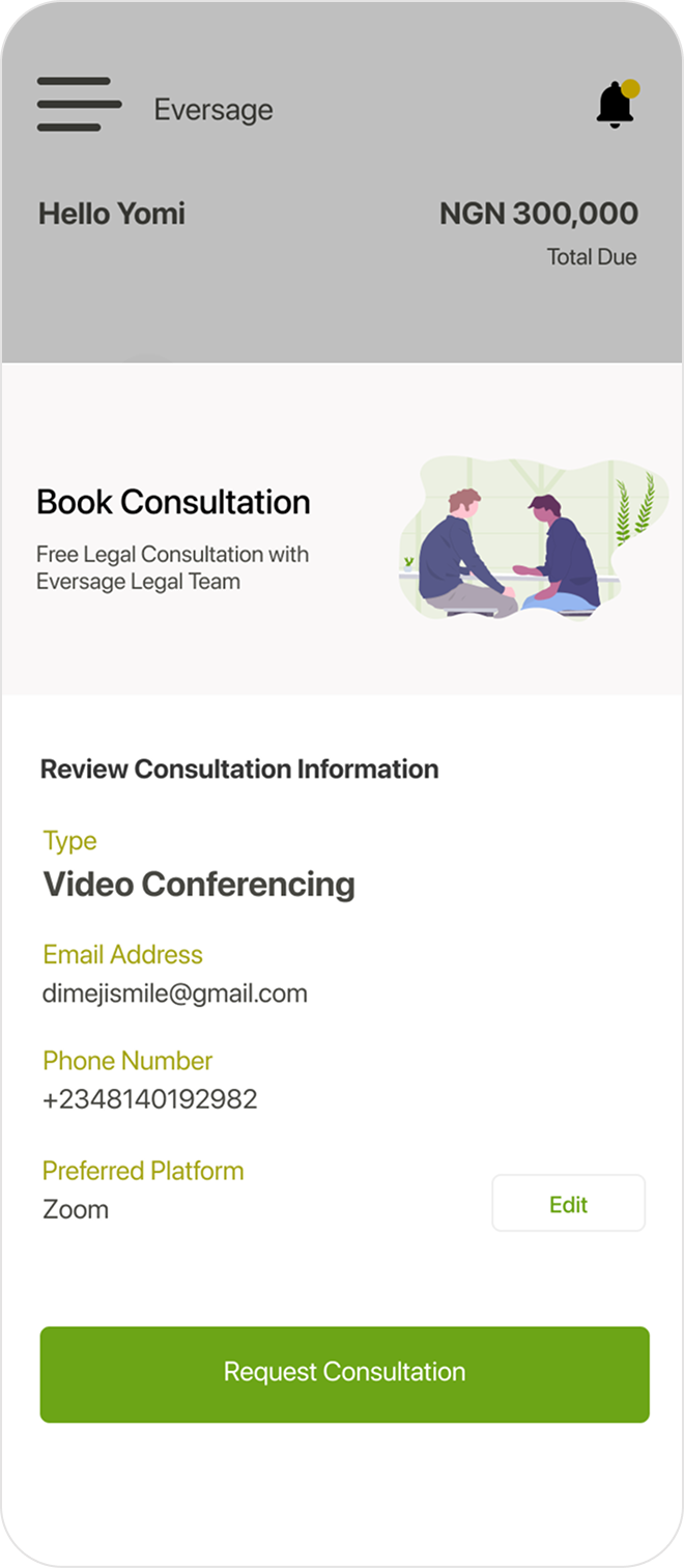
06 — Book Consultation Flow
The consultation booking flow is deliberately minimal: contact details (name, country, phone) on step one, then a full review screen before submitting. The review shows consultation type, email, phone, and preferred platform (Zoom) — with an "Edit" escape if anything needs changing. The green "Request Consultation" CTA is the only action on the review screen, removing decision fatigue at the point of commitment.
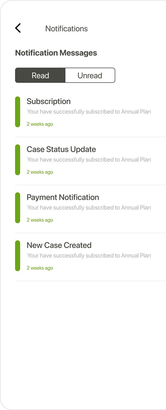
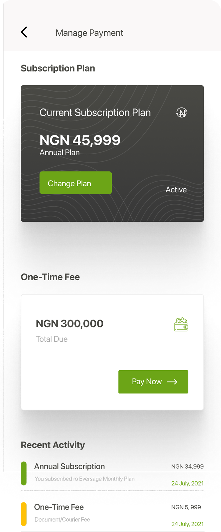
07 — Supporting Screens
The Notifications screen uses a Read / Unread toggle — giving users control over their inbox without overwhelming badge counts. The Manage Payment screen surfaces the subscription plan as a premium dark card, with the one-time fee and recent activity below. A green "Pay Now" button is the only primary action, ensuring no confusion about what to do next.
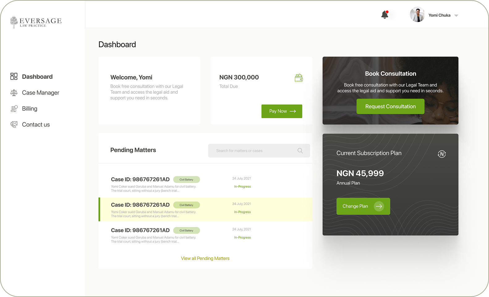
08 — Client Web Dashboard
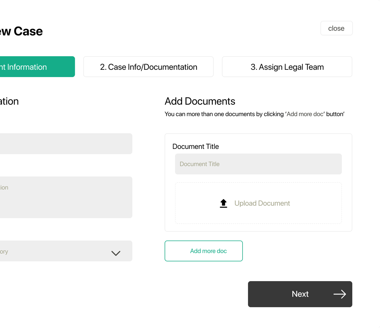
The client web dashboard uses a persistent left sidebar, a main content panel for pending matters, and a right rail for contextual cards (Book Consultation, Current Subscription). All critical information is visible above the fold — no scrolling required for the core use case. A three-step "Create New Case" wizard (Client Information → Case Info/Documentation → Assign Legal Team) turns a complex intake process into a completable, guided sequence.
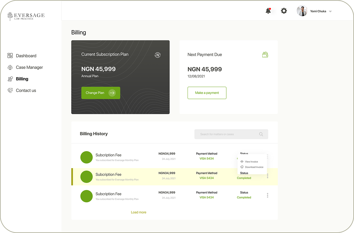
09 — Billing
The billing page puts the current subscription plan front and centre (NGN 45,999 / Annual), with a "Next Payment Due" panel alongside it. The billing history table below is fully searchable and exposes View Invoice and Download Invoice actions inline — reducing the usual back-and-forth of chasing payment records with a firm.
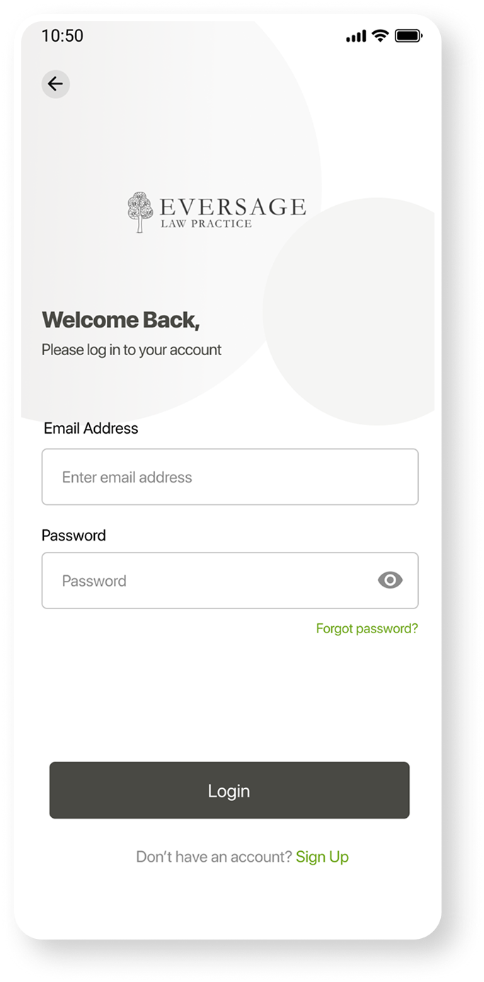
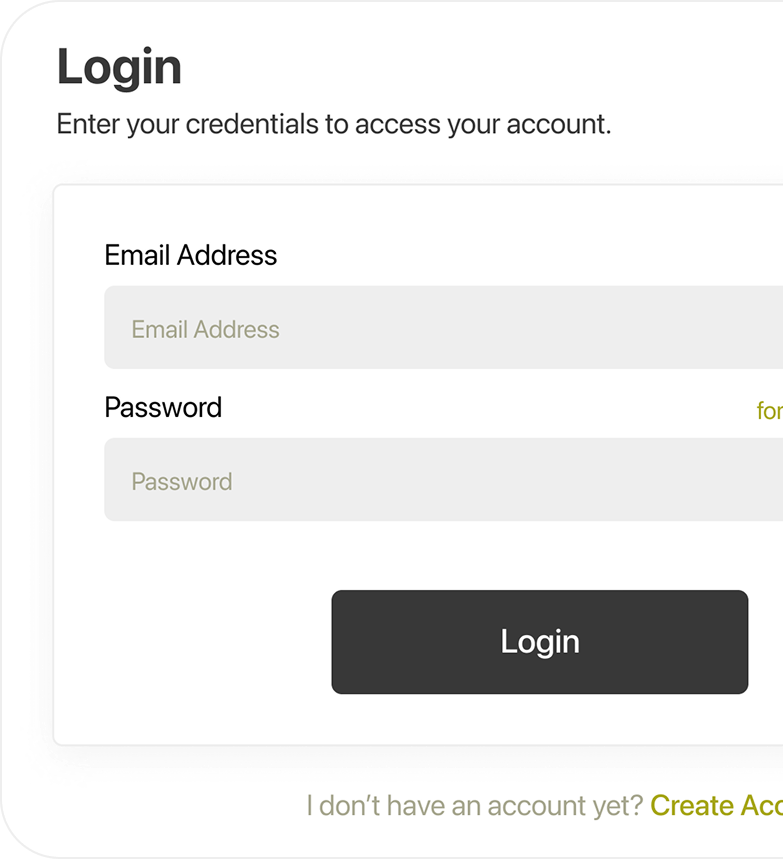
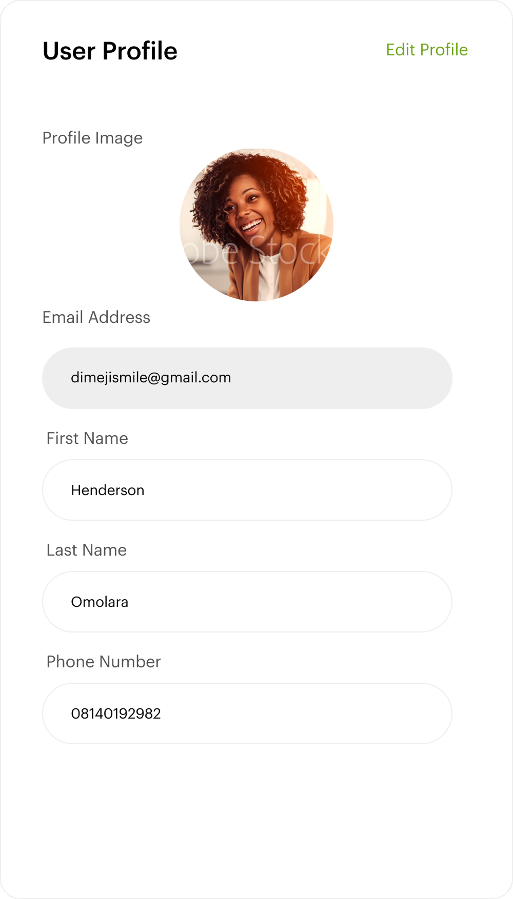
10 — Lawyer Auth & Profile
The lawyer portal uses a visually distinct login — dark grey background with an olive/gold "Forgot password" accent — immediately differentiating it from the client login without requiring a separate URL. The user profile page shows the lawyer's photo, name, email, and phone in a clean read-then-edit layout. "Edit Profile" is a text link, not a prominent button — appropriate for an infrequent action that shouldn't compete with the operational dashboard.
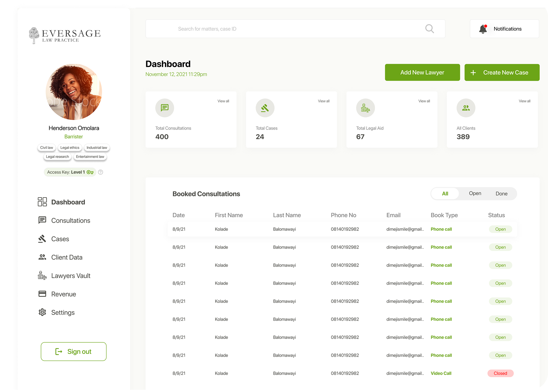
11 — Lawyer Dashboard
The lawyer dashboard is a fundamentally different product from the client dashboard. KPIs come first (400 consultations, 24 cases, 67 legal aid, 389 clients), then a full Booked Consultations table with date, client name, phone, email, consultation type, and status. The sidebar surfaces the lawyer's profile, specialisations (Civil law, Legal ethics, Industrial law, Entertainment law), and access level — anticipating role-based access control without overcomplicating the current interface.
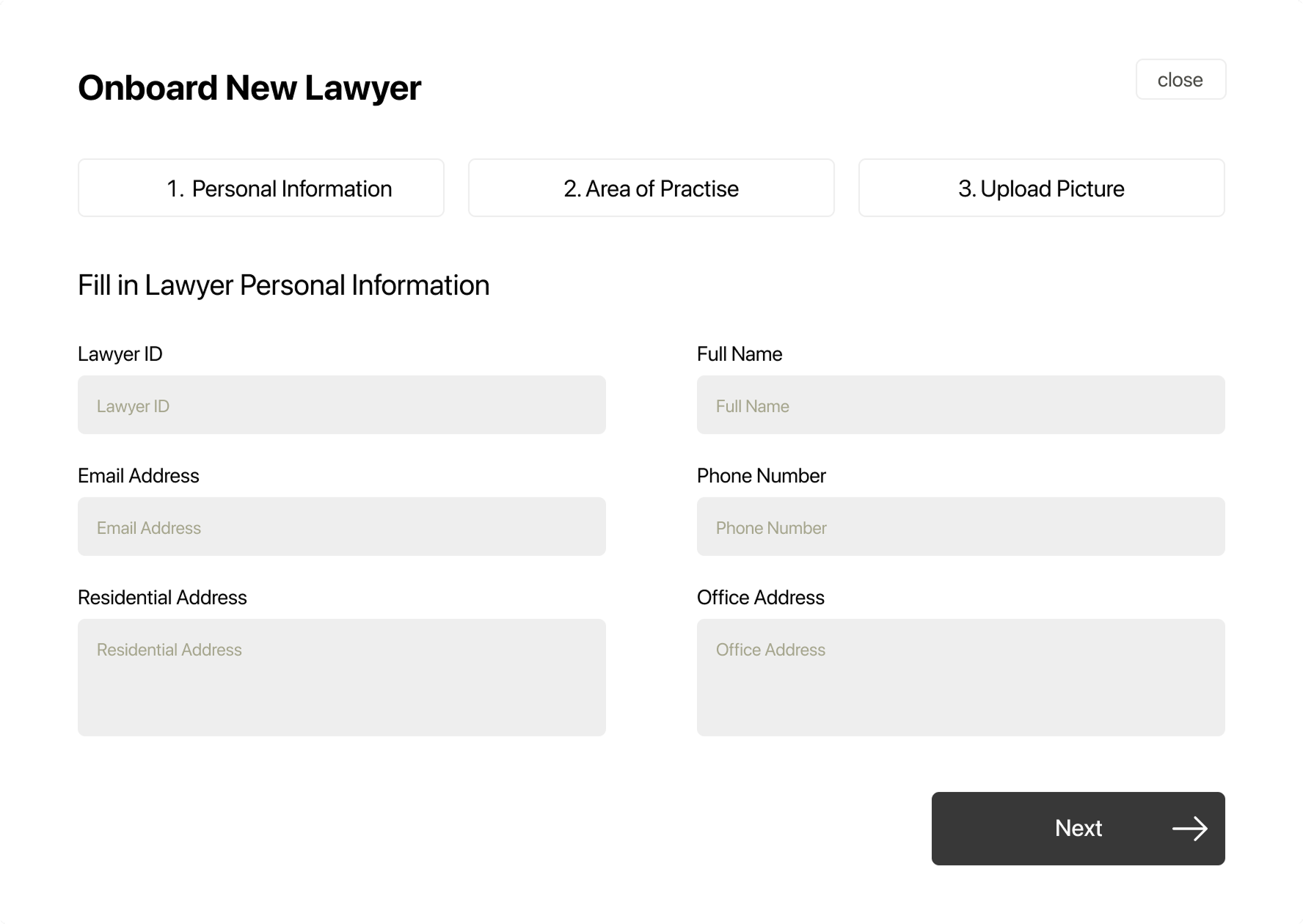
12 — Admin Flow
The "Onboard New Lawyer" wizard uses the same 3-step tab pattern as the client's "Create New Case" — a consistent mental model across both portals. Step 1 captures personal information (ID, name, email, phone, residential and office addresses). Step 2 collects areas of practice. Step 3 handles photo upload. This structure makes a complex administrative task feel manageable without overwhelming the form.
13 — Design System
| Element | Decision | Rationale |
|---|---|---|
| Dark green hero | #162016 on all hero surfaces | The darkest brand tone communicates legal authority — weight and gravitas, not friendliness |
| Eversage green accent | #3a7d2e for CTAs, active nav, FAB, and status indicators | Single accent across all three platforms creates cross-surface recognition without a complex token system |
| Case status — left border | Green left border on active/pending case rows | Consistent across mobile and web — users switching platforms instantly recognise the pattern |
| Dark subscription card | Charcoal textured card for subscription plan (mobile + web) | Visual weight signals financial importance; the topographic texture adds premium quality without photography |
| Lawyer login — dark bg | Grey (#3b3b3b) background vs white for clients | Distinguishes the two portals without requiring separate branding, logos, or URLs |
| 3-step wizard | Used for Create New Case and Onboard New Lawyer | One consistent mental model for all complex multi-field forms across the entire product |
14 — Impact
"The hardest part of designing for a law firm isn't the complexity of the data — it's the tone. Legal interfaces have to feel like they belong in a courtroom and on a smartphone simultaneously. That's the tension we designed into every screen."